30 Living Room Wall Decor Ideas That Feel Luxurious
Your walls are the first thing anyone notices when they walk into your living room. Yet most walls sit completely bare, flat, and forgettable — and that one detail makes even beautiful furniture feel unfinished. The right living room wall decor ideas change everything about how a room looks and feels.
I’ve noticed that people often underestimate what a single well-chosen wall treatment can do. One bold piece of art, one textured panel, or one curated shelf arrangement can anchor an entire room’s personality without touching a single piece of furniture. I’ve seen plain, budget-friendly apartments transform completely through wall styling alone — no renovation required.
This article covers 30 luxurious wall decor ideas for living rooms of every size, style, and budget. Whether you live in a small apartment, a rental home, or a spacious family house, these ideas give you real, actionable direction. From oversized statement art and limewash paint finishes to woven basket displays and neon sign features, every idea here solves a specific styling problem. Experienced interior designers and home stylists consistently use these exact approaches to create rooms that feel designed, layered, and genuinely high-end. You will find at least one idea here that works perfectly for your space today.
1. Oversized Statement Art
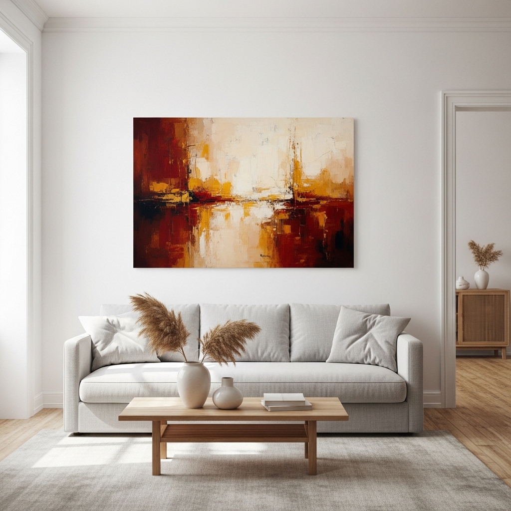
A single large painting above your sofa instantly anchors the entire room. I’ve noticed that oversized wall art makes a space feel curated and intentional, even in simple, budget-friendly living rooms. This wall styling trick works best in rooms with neutral furniture and minimal clutter on surrounding surfaces.
Large-scale art pulls the eye upward and makes ceilings feel taller. That’s why many stylists recommend skipping small framed prints when you have a wide, empty wall to work with. One bold piece does far more than a collection of tiny unrelated frames scattered randomly.
- Creates an instant focal wall point
- Makes ceilings feel taller visually
- Works with neutral room decor
- Replaces the need for extra accessories
- Suits rental-friendly wall styling
Choosing the right size matters as much as the artwork itself. Your painting should span at least two-thirds of your sofa’s width for proper visual balance. I’ve seen this rule ignored many times, and the result always feels slightly off and unfinished.
Go for abstract prints if you want timeless appeal. Botanical illustrations and landscape art also look rich against white or warm-toned walls. Either direction gives your living space a polished, gallery-worthy feel without spending thousands.
2. Sculptural Plaster Wall
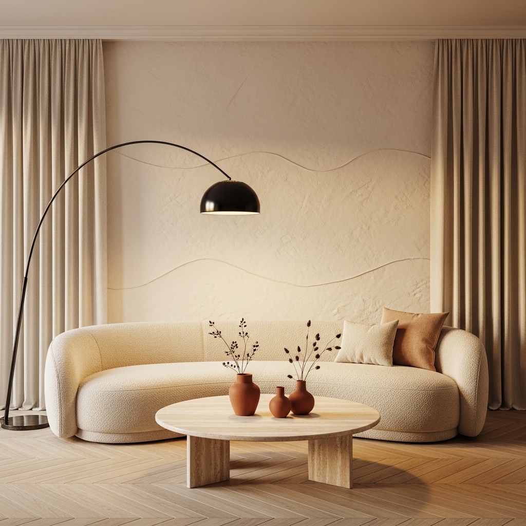
A textured plaster wall adds depth and warmth that flat painted walls simply cannot match. In my experience, this treatment feels luxurious in person because light catches every ridge and curve differently throughout the day. Rental-friendly plaster wallpaper versions now make this look accessible without permanent commitment.
Three-dimensional wall treatments are one of the fastest-rising interior design trends right now. Designers confirm that sculptural finishes create rooms that feel experienced rather than just observed. This idea works beautifully in living rooms where the goal is a cozy, high-end European feel.
- Adds tactile depth to plain walls
- Catches light beautifully all day
- Works with minimal furniture styling
- Pairs well with neutral toned sofas
- Rental-friendly peel-and-stick versions available
The beauty of this treatment lies in its simplicity. You do not need extra wall art once a plaster feature wall is in place. The wall itself becomes the statement and carries the whole room’s personality.
Warm lighting amplifies the texture dramatically. A soft arc floor lamp angled toward the plaster wall creates an incredible shadow play. This combination consistently earns the most saves when seen on home decor inspiration boards.
3. Gallery Wall Cluster
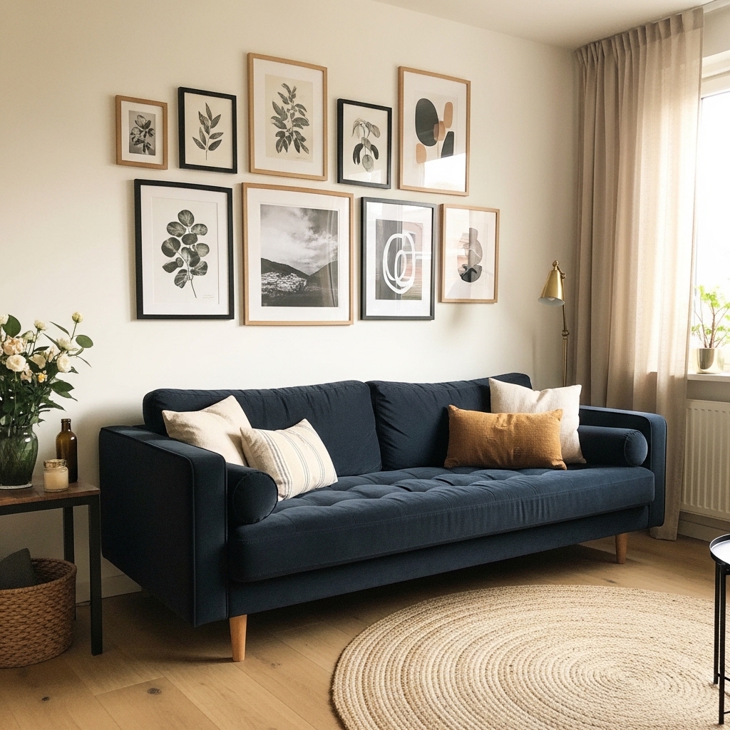
A gallery wall tells the story of a home instantly. Mixing frame sizes, materials, and art styles creates a collected, layered look that feels personal and visually rich. This approach works for nearly any living room size — from small apartments to open-plan spaces.
That’s why many stylists recommend starting with a paper template before hammering a single nail. Lay your frames on the floor first, arrange them until the grouping feels balanced, then trace the layout on the wall. This step saves hours of frustrating patchwork repair later.
- Mix brass, black, and wood frames
- Combine photos with abstract prints
- Keeps walls from feeling too bare
- Works above sofas or console tables
- Easy to refresh with seasonal art swaps
Choosing a unifying element keeps the gallery from feeling chaotic. Use one consistent color in every piece, whether in the artwork or the frame tone. I’ve tried fully random collections and they always look busy rather than beautiful.
Black-and-white photography paired with a single botanical print creates a timeless base. You can layer in color gradually as your confidence grows. This layered approach to living room wall styling gives you full creative control over time.
4. Warm Wood Slat Panel
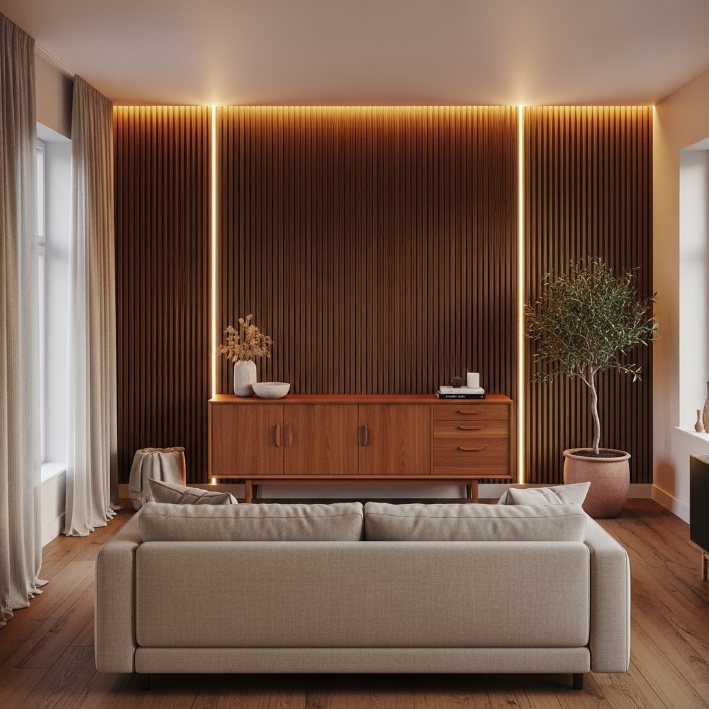
Vertical wood slat panels make any living room wall feel architectural and intentional. I’ve noticed this design creates an immediate sense of warmth that paint and wallpaper alone rarely achieve. The panels work exceptionally well in modern and Scandinavian-inspired homes with natural material palettes.
Hidden LED lighting behind wood slats takes this look to another level entirely. Soft warm light filtering through the panels creates a cozy glow that transforms an ordinary evening at home. This layered lighting approach is one of the most searched home decor styling trends right now.
- Adds warmth with natural wood texture
- LED lighting creates evening ambiance
- Pairs beautifully with linen furniture
- Works as a TV or sofa backdrop
- Suits both modern and warm classic styles
The slat panels do not require full professional installation in all cases. Many peel-and-press slat wall kits now come ready to apply directly to drywall. This makes the look achievable for renters and budget-conscious decorators alike.
Walnut, oak, and white-washed finishes are all popular choices depending on your room’s color palette. Darker walnut suits moody, cozy living rooms. Light oak keeps spaces feeling bright and fresh. Either direction looks genuinely high-end and carefully designed.
5. Oversized Decorative Mirror
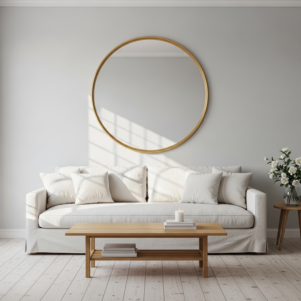
A large decorative mirror doubles the visual size of any living room instantly. Reflective surfaces bounce natural light across the room, making even small and dark spaces feel open and bright. I’ve seen this one trick completely change how a cramped apartment living room feels to anyone who enters.
Round mirrors with brass or black frames are among the most saved home decor ideas across inspiration platforms. The circular shape softens boxy room layouts and adds a sculptural quality to the wall. This styling choice works for minimalist, modern, and transitional interior styles equally well.
- Reflects natural light across the room
- Makes small living spaces feel larger
- Round frames soften boxy wall shapes
- Brass finish adds warm luxury touch
- Works above sofas or console tables
Placement matters enormously with mirrors. Hanging one opposite a window maximizes light reflection throughout the day. I always recommend this placement first before considering any other wall in the room.
Oversized floor mirrors leaning against the wall also look effortlessly chic. This approach suits renters who prefer not to drill large holes. The leaning style also feels relaxed and editorial, which photographs beautifully for home styling content.
6. Floating Shelf Vignette
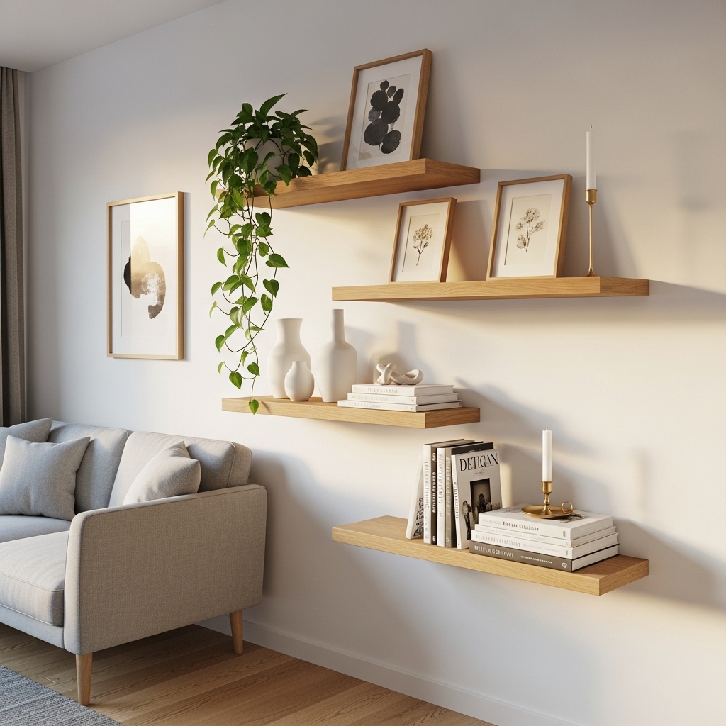
Floating shelves create a living wall that tells your story through objects you actually love. Each shelf becomes a small curated vignette, combining practical storage with genuine visual artistry. This approach works beautifully in living rooms where wall space is limited but personality is not.
In my experience, the biggest mistake people make is overcrowding every shelf. Leaving intentional empty space between objects makes each piece feel more important and the overall look far more considered. That breathing room is exactly what separates a styled shelf from a cluttered one.
- Mix books, plants, and ceramic vases
- Leave empty space for visual breathing room
- Use odd numbers for natural balance
- Layer heights to create depth interest
- Swap accessories seasonally without effort
Trailing plants like pothos or ivy add life and softness that no manufactured accessory can replicate. A single plant draping over one shelf edge creates an organic, lived-in quality. This combination of greenery and curated objects consistently resonates with home decor audiences.
Brass, black, or raw wood brackets add their own design detail. Even the hardware becomes part of the aesthetic. Choose a bracket style that matches your room’s overall material palette for a cohesive, intentional finish.
7. Linen Fabric Wall Panel
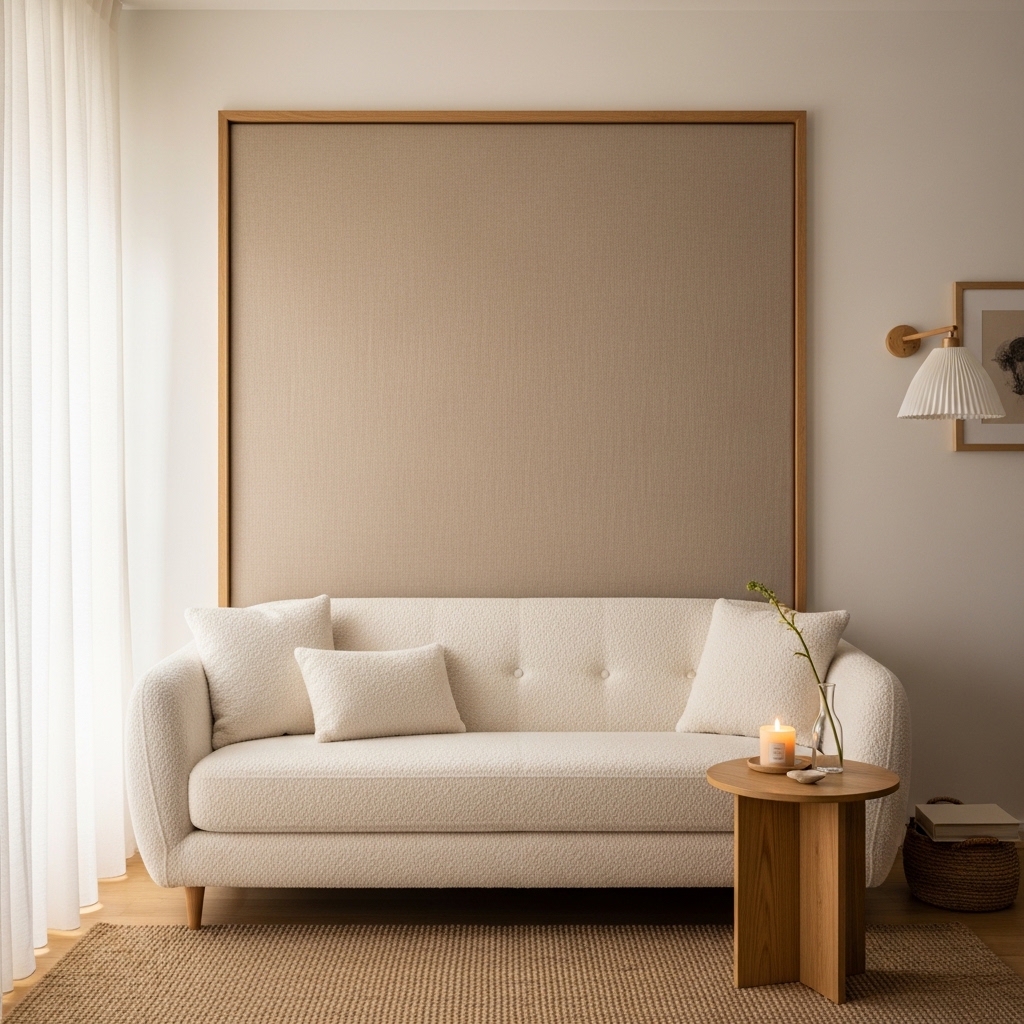
Fabric wall panels bring warmth, texture, and sound absorption into a living room all at once. Linen and boucle panels in neutral tones create a spa-like softness that feels immediately calming to anyone entering the space. This idea works especially well in apartments where hard surfaces make rooms feel cold and echo-y.
That’s why many interior designers now recommend upholstered wall panels as an affordable luxury upgrade. They require no special tools and hang similarly to framed art. A single large linen panel centered above your sofa can replace an entire gallery wall arrangement.
- Adds warmth and acoustic softness
- Creates a spa-like calm atmosphere
- Works well in small or noisy apartments
- Pairs beautifully with boucle furniture
- No painting or permanent changes needed
Neutral tones like oatmeal, warm white, and dusty sage work across nearly all living room color schemes. These shades photograph beautifully in natural light, which makes them perfect for home content creation. I’ve tried bolder colors and they tend to limit your flexibility when refreshing the room.
DIY versions using a wooden frame and upholstery fabric cost very little to make. Many home decor creators share detailed tutorials using canvas stretchers and fabric stapled at the back. The result looks professional and genuinely expensive despite the low material cost.
8. Arched Wall Niche
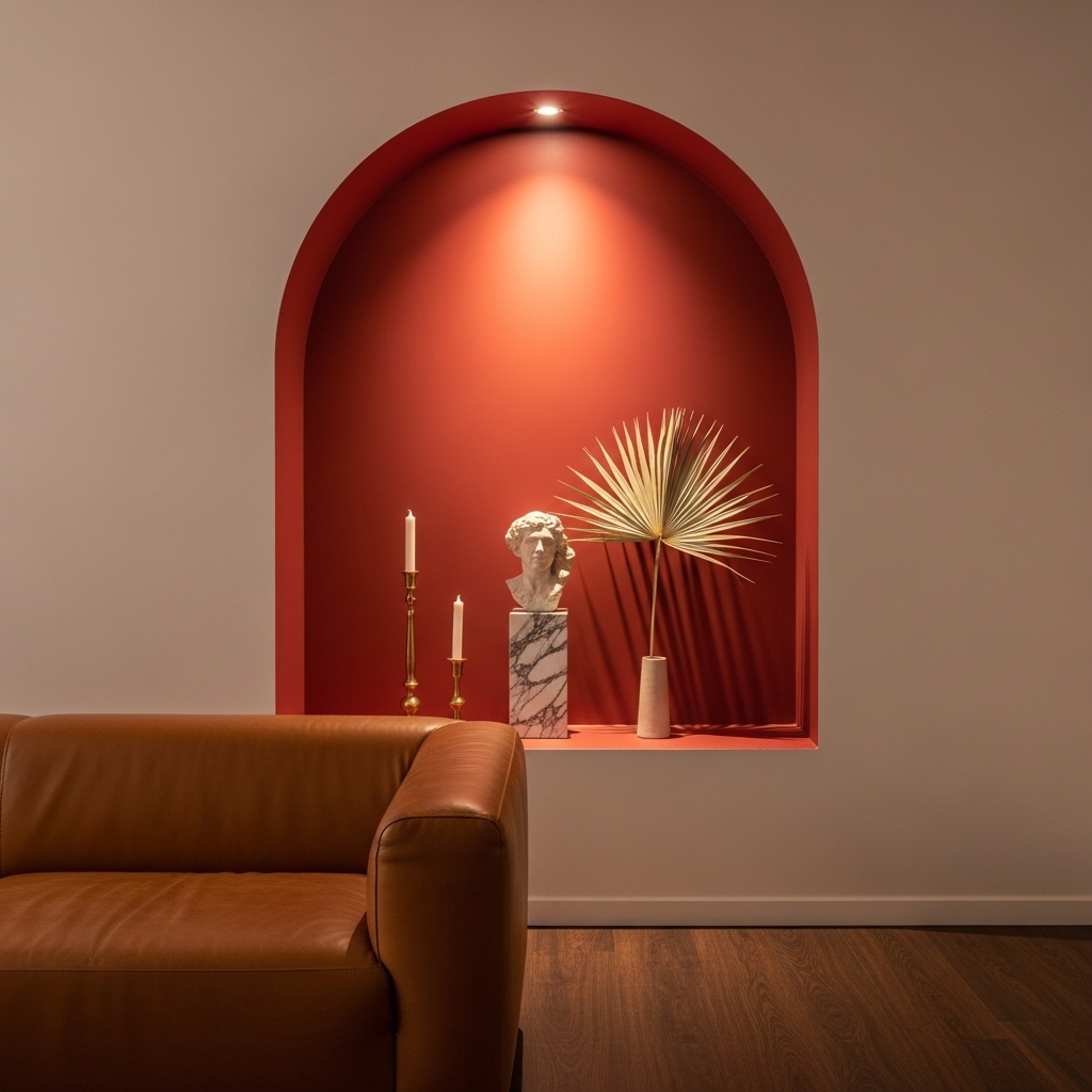
An arched niche turns a flat, boring wall into an architectural feature that looks designed from the ground up. Painting the inside of the niche in a contrasting deep tone — terracotta, sage, or navy — makes objects displayed inside look like precious exhibits. This technique creates drama without needing expensive furniture or accessories.
Interior designers use this approach to give older homes a fresh, boutique-hotel quality. The arched shape feels timeless and works across Mediterranean, modern, and eclectic decorating styles. I’ve seen even a painted faux niche create nearly the same visual impact at a fraction of the cost.
- Creates a natural display focal point
- Deep contrast paint adds richness inside
- Works with sculptural and ceramic objects
- Suits Mediterranean and modern interiors
- Adds architectural interest to plain walls
The objects you place inside matter as much as the niche itself. One statement piece — a sculptural vase, a small bust, or a tall candlestick — looks far more intentional than filling the niche with too many small items. Restraint is always the more luxurious choice.
Lighting placed directly above the niche enhances the drama beautifully. A small recessed spotlight or a tiny picture light directed downward creates a museum-quality glow. This detail alone makes the entire wall feel deliberately and professionally styled.
9. Maximalist Tapestry Hang
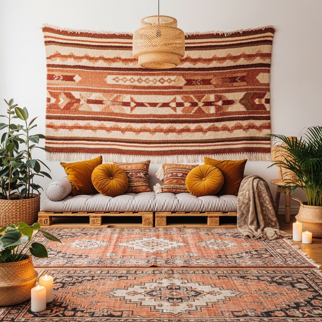
A large woven tapestry brings color, texture, and global warmth to a living room wall in one single move. Unlike framed art, tapestries soften acoustics and add a fabric dimension that changes how the room feels physically, not just visually. This approach suits bohemian, eclectic, and globally inspired home styling perfectly.
Tapestries photograph beautifully against natural light and consistently earn high engagement on home decor platforms. The texture in woven fabrics creates incredible visual depth that flat-printed art simply cannot achieve. I’ve used tapestries in rooms with minimal furniture, and they instantly made the space feel fully designed.
- Fills large walls without heavy frames
- Adds acoustic softness to hard rooms
- Creates a rich textural focal wall
- Works in boho and eclectic styled homes
- Easy to hang and remove for renters
Choosing the right scale is essential for this look to succeed. Your tapestry should fill at least 60 to 70 percent of the wall space above your sofa. A small tapestry on a large wall looks unintentional and visually lost.
Hanging tapestries with a dowel rod and natural rope looks more considered than using nails and string. This mounting style adds a design detail at the top edge of the piece. It also makes the tapestry easier to remove and reposition as your styling evolves.
10. Black Accent Wall
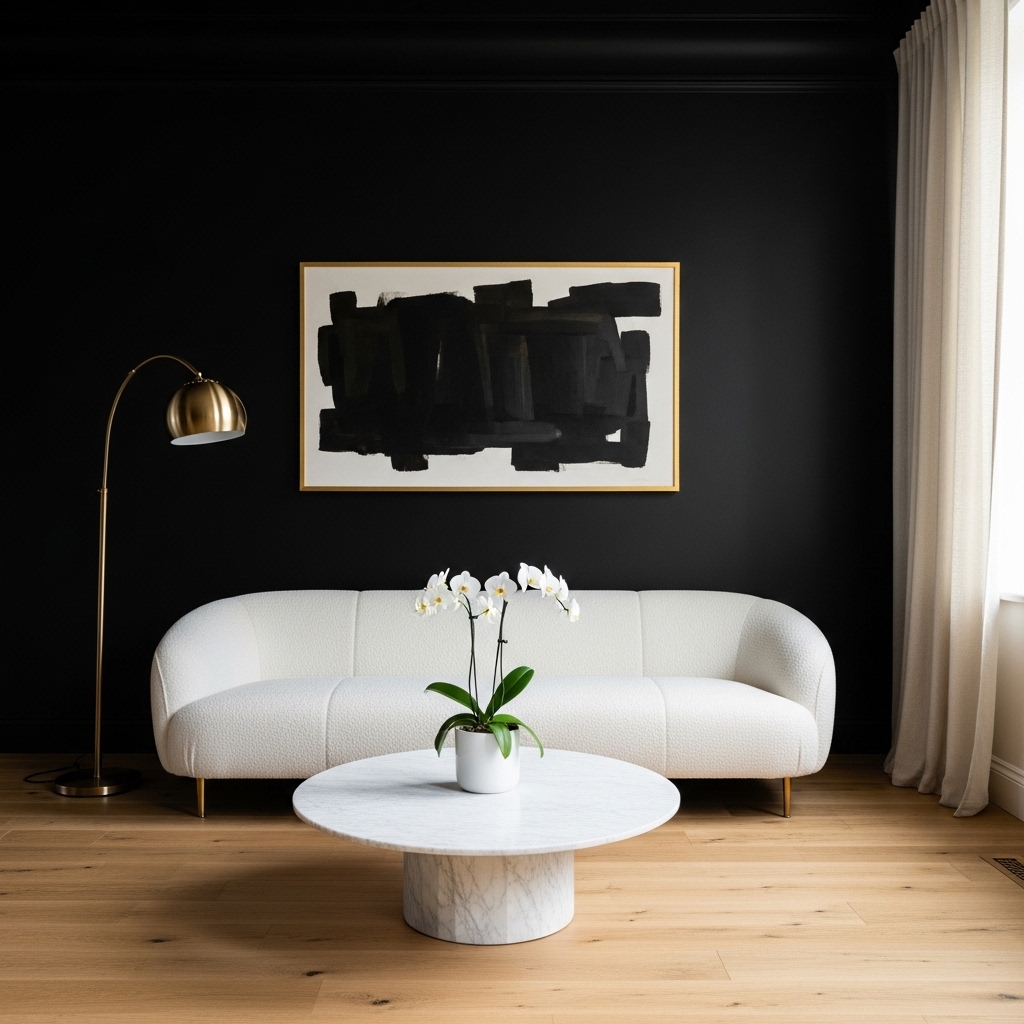
A matte black accent wall creates the highest possible contrast in a living room and instantly signals sophisticated, confident design. Paired with white or cream furniture, the effect looks like a luxury hotel suite rather than a typical home. This bold wall color choice works surprisingly well even in medium-sized rooms.
In my experience, many people hesitate to paint one wall black out of fear it will shrink the space. In reality, a dark accent wall behind a sofa actually recedes visually, making the room feel deeper and more layered. The contrast draws focus forward onto furniture and accessories you already own.
- Creates high-contrast luxury atmosphere
- Makes white furniture stand out sharply
- Pairs beautifully with gold accessories
- Makes rooms feel deeper and more dramatic
- Works as a strong sofa backdrop wall
Gold frames, brass hardware, and warm lighting all glow beautifully against a black wall. This combination hits a very specific sweet spot between moody and glamorous. Interior design photographers consistently choose this setup for editorial home shoots.
One coat of quality matte black paint transforms the entire energy of a room. You do not need new furniture or expensive accessories to make it work. The wall color does all the heavy lifting entirely on its own.
Here is Batch 2 — Ideas 11 to 20.architecturaldigest+1youtube
11. Limewash Paint Finish
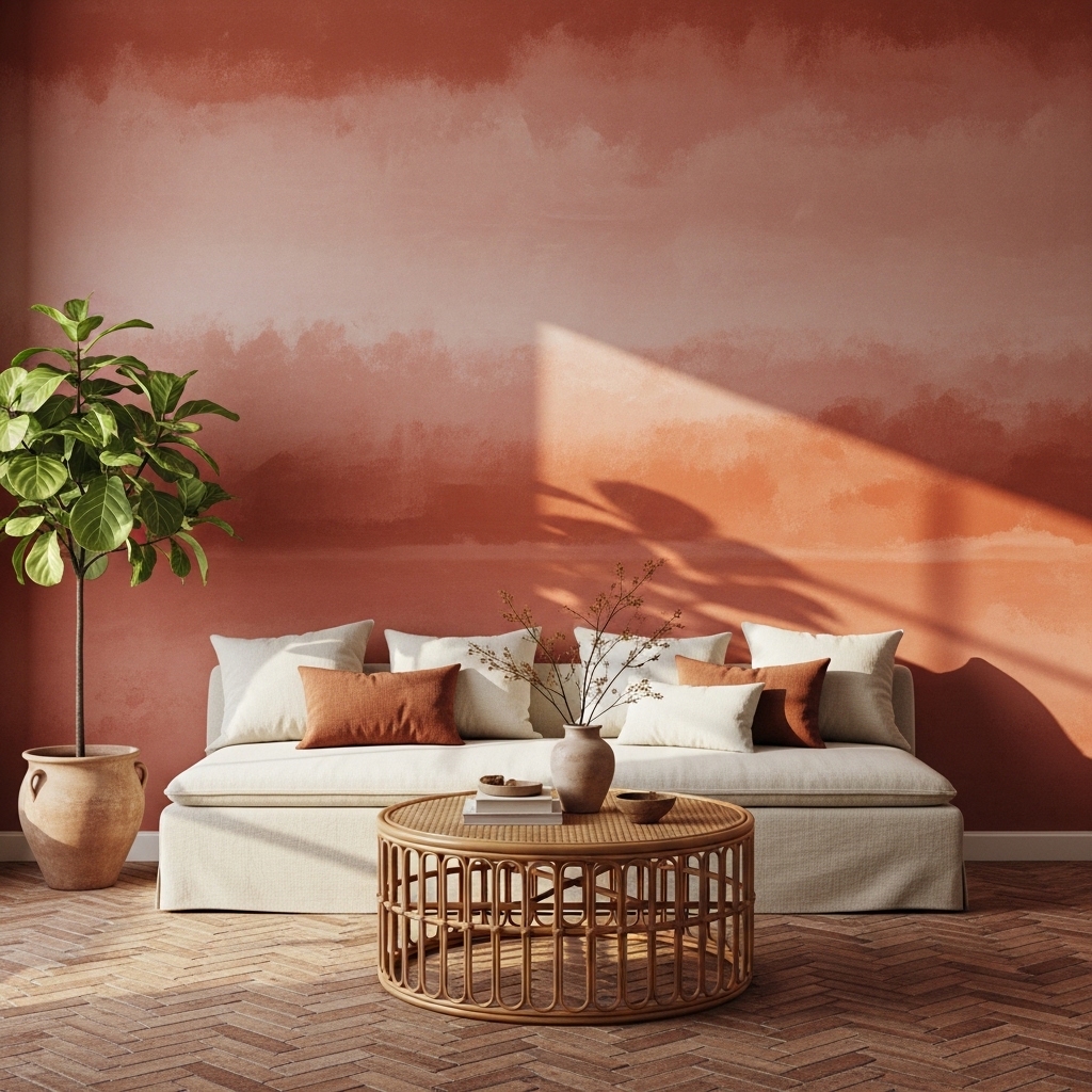
Limewash paint creates a wall finish that looks centuries old in the most beautiful way possible. The layered application of mineral pigments produces depth and tonal variation that standard flat paint never achieves. I’ve noticed this technique makes warm-toned living rooms feel immediately more intimate and rich.
Designers actively recommend this finish for clients who want luxury without wallpaper installation costs. The color shifts depending on light direction and time of day, which keeps the wall feeling alive rather than static. That quality is exactly why this finish photographs so well in home decor content.architecturaldigest
- Adds rich aged texture to bare walls
- Shifts tone in different natural light
- Works with Mediterranean and organic decor
- Pairs beautifully with rattan furniture
- One application lasts for many years
Limewash also works as a DIY project for confident beginners. You apply it with a thick natural brush using loose, circular strokes. The imperfections in your technique actually improve the final result rather than showing as mistakes.
Warm colors like terracotta, sage, and dusty rose all work beautifully with this finish. Cooler tones like slate blue and pale gray also create a striking, moody quality. Either direction gives plain drywall a genuinely handcrafted appearance.
12. Wainscoting Panel Wall
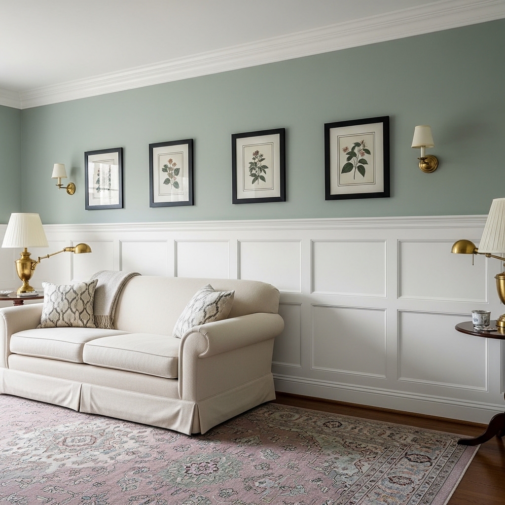
Wainscoting panels add architectural interest to any living room wall at a relatively low cost. The paneling divides the wall into two zones — texture below and art space above — which creates a layered, intentional look that feels built-in rather than decorated. This detail alone adds significant perceived value to a room.
Traditional American homes use this treatment extensively, and it remains a timeless choice because it suits nearly every furniture style. Painted in bright white, it brightens a room and makes trim details pop sharply against colored upper walls. I’ve seen wainscoting refresh older homes completely without any major renovation.submaterial
- Adds classic architectural wall interest
- Divides walls into two styled zones
- Works with traditional and transitional decor
- Pairs beautifully with botanical wall art
- Painted white brightens the entire room
Choosing the right panel height matters here. Standard wainscoting sits about one-third of the way up the wall. Taller panels that reach two-thirds up create a more dramatic, library-like feel in larger living rooms.
Sage, navy, and warm white are the top color combinations for the upper wall above wainscoting panels. The contrast between the paneled lower section and the painted upper wall adds depth that a single-color room cannot match. This classic pairing never looks dated.
13. Vintage Map Wall Art
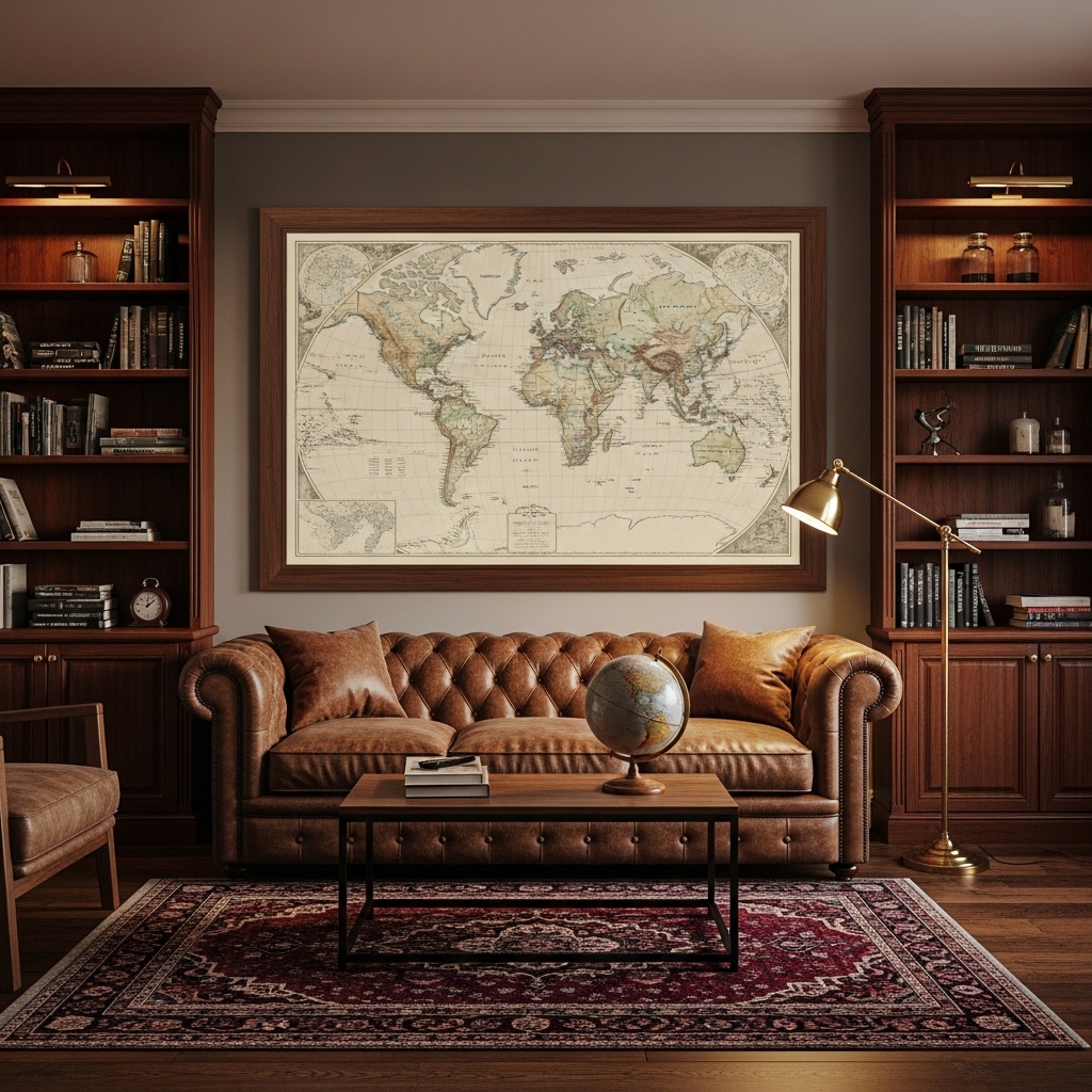
A large vintage map transforms a living room wall into a conversation piece that signals curiosity, travel, and personality all at once. Framed in dark wood or brass, an antique-style map immediately adds a collected, storied quality that reproduction art simply cannot replicate. This look works beautifully in study-inspired and transitional living rooms.
I’ve noticed this decor idea works especially well in homes that mix leather furniture with bookshelves and warm lighting. The sepia tones of vintage cartography complement brown leather, brass, and mahogany wood almost perfectly. Together, these elements create a room that feels like it belongs in a classic English townhouse.havenly
- Creates an instant conversation focal piece
- Pairs beautifully with leather furniture
- Suits intellectual and travel-inspired homes
- Antique tones complement warm wood finishes
- Works for both small and large wall spaces
Sizing up your map print significantly increases its impact. A map smaller than 24 by 36 inches reads as a small poster rather than a statement piece. Go large, frame it well, and let it own the wall entirely.
City maps, national park posters, and antique botanical charts all follow the same visual logic as world maps. Any vintage-style illustration printed at scale and properly framed earns immediate attention. The key is always in the framing quality and the size choice.
14. Terracotta Tile Accent Wall
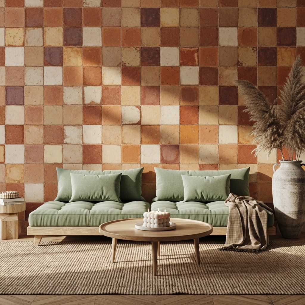
Handmade terracotta tiles on an accent wall bring an earthy richness that painted walls cannot replicate. The slight color variation in each tile creates a naturally mottled surface that catches light beautifully and looks genuinely handcrafted. This approach suits bohemian, Southwestern, and Mediterranean-influenced living rooms.
Installing tile on one wall rather than an entire room keeps costs manageable without sacrificing visual impact. Designers often use this approach to introduce material texture in living rooms that feel overly flat or generic. I’ve seen terracotta tile walls completely define the entire mood of a neutral living room.
- Adds warm earthy texture to plain walls
- Each tile shows natural color variation
- Works in boho and Southwestern styled rooms
- Pairs beautifully with sage and cream sofas
- Creates a durable, long-lasting wall feature
Grouting in a tone that matches the tile rather than contrasting it creates a seamless, painterly look. This technique makes the wall read as one rich textured surface rather than a grid of individual tiles. The result feels far more intentional and artisanal.
Pairing terracotta tile walls with natural linen, rattan, and dried botanical arrangements keeps the earthy theme cohesive. Adding a single modern element — a sleek floor lamp or a geometric coffee table — prevents the look from feeling too rustic and keeps it squarely in current design territory.
15. Botanical Print Collection
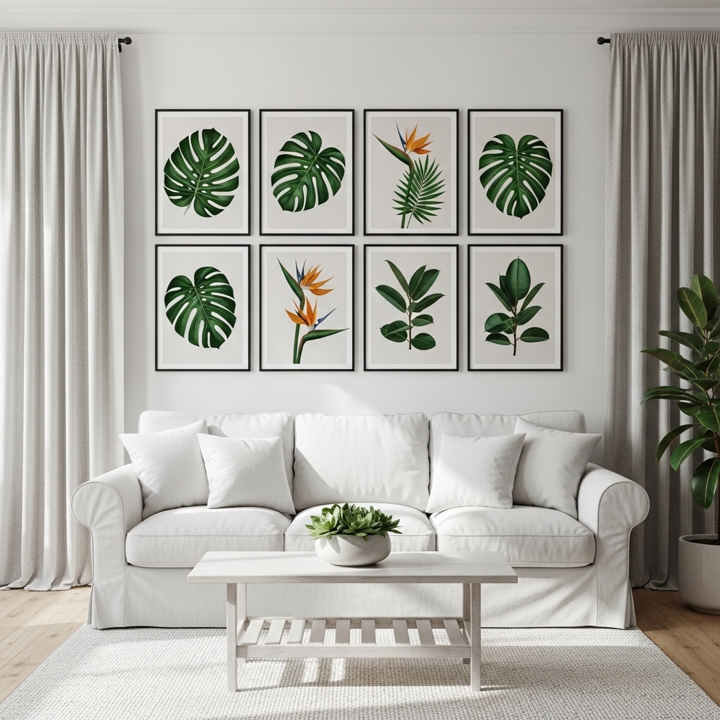
A curated set of botanical prints brings the calm energy of nature directly onto your living room walls. Deep green illustrations against cream or white backgrounds suit almost any neutral room palette and photograph beautifully in natural light. This living room wall idea is one of the most consistently popular choices on home styling platforms.
The symmetrical grid arrangement gives this style a clean, gallery-quality structure that feels professionally designed rather than randomly assembled. Six prints in two rows of three creates perfect visual balance above a standard sofa width. That’s why many stylists recommend this exact layout as a starter gallery arrangement for first-time home decorators.
- Clean grid layout feels gallery-quality
- Deep greens suit most neutral room palettes
- Brings nature-inspired calm to wall styling
- Tropical leaf prints are timeless design choices
- Budget-friendly downloadable print options available
Printing your own botanical art from digital download shops costs a fraction of purchased framed prints. You choose your own sizes and frame them locally for a fully customized result. This approach gives you full creative control over the final look and feel.
Mixing botanical styles — one monstera, one fiddle leaf, one fern — within the same color palette creates variety without chaos. Keeping all frames identical ties the collection together. This combination of variety and uniformity is the exact formula professional stylists use consistently.
16. Backlit Floating Shelves
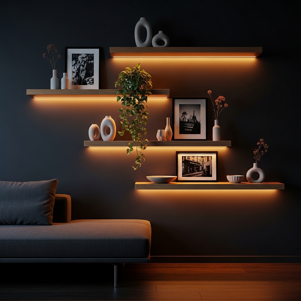
Backlit floating shelves create two design features at once — a styled display surface and a built-in lighting element that warms the entire room. The warm glow beneath each shelf produces a soft layered light effect that makes evenings at home feel genuinely luxurious. This approach suits modern, minimalist, and moody dark living rooms particularly well.
In my experience, standard floating shelves look completely different once warm LED strips are added underneath. The transformation is immediate and dramatic without requiring any additional furniture or accessories. I always recommend this upgrade first to clients who want to add ambiance without repainting or redecorating.youtube
- Creates ambient layered lighting effect
- Makes shelves feel built-in and architectural
- Works beautifully in dark-toned living rooms
- Pairs well with ceramics and trailing plants
- Easy LED strip installation under each shelf
Choosing warm white LEDs rather than cool white is essential here. Cool white light looks clinical and harsh against natural wood. Warm white at 2700K to 3000K creates the cozy golden glow that makes this combination so popular on home inspiration boards.
Styling each shelf with maximum three objects keeps the look curated rather than crowded. One plant, one sculptural piece, and one framed artwork or book stack covers all texture types. This restraint is exactly what makes the shelf styling look intentional and considered.
17. Stacked Stone Feature Wall
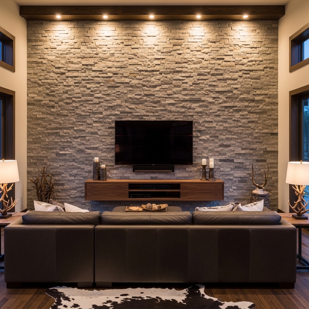
A stacked stone accent wall anchors a living room with a natural authority that no painted surface can rival. The layered texture of real or faux stone creates depth and shadow that shifts beautifully throughout the day as light changes direction. This treatment suits mountain lodge, rustic modern, and transitional American living room styles.
Faux stone panels now replicate the look of real stacked stone with impressive accuracy. They weigh significantly less than real stone and install directly over drywall with construction adhesive. That’s why many homeowners now choose this option to achieve the look without structural reinforcement or professional masonry costs.submaterial
- Adds natural authority to large living walls
- Works beautifully as a TV backdrop wall
- Stone texture shifts beautifully with light
- Suits rustic, lodge, and modern transitional styles
- Faux panels offer budget-friendly installation
Warm recessed lighting aimed directly at the stone surface amplifies every ridge and layer in the material. This lighting direction creates deep shadow lines that make the texture look even more dramatic and real. Without proper lighting, even genuine stone walls can appear flat and underwhelming.
Pairing a stone wall with dark leather furniture, warm wood tones, and cowhide textiles creates a cohesive rustic-modern palette. The combination of rough stone, smooth leather, and warm wood covers all the texture categories that make a room feel visually complete and satisfying.
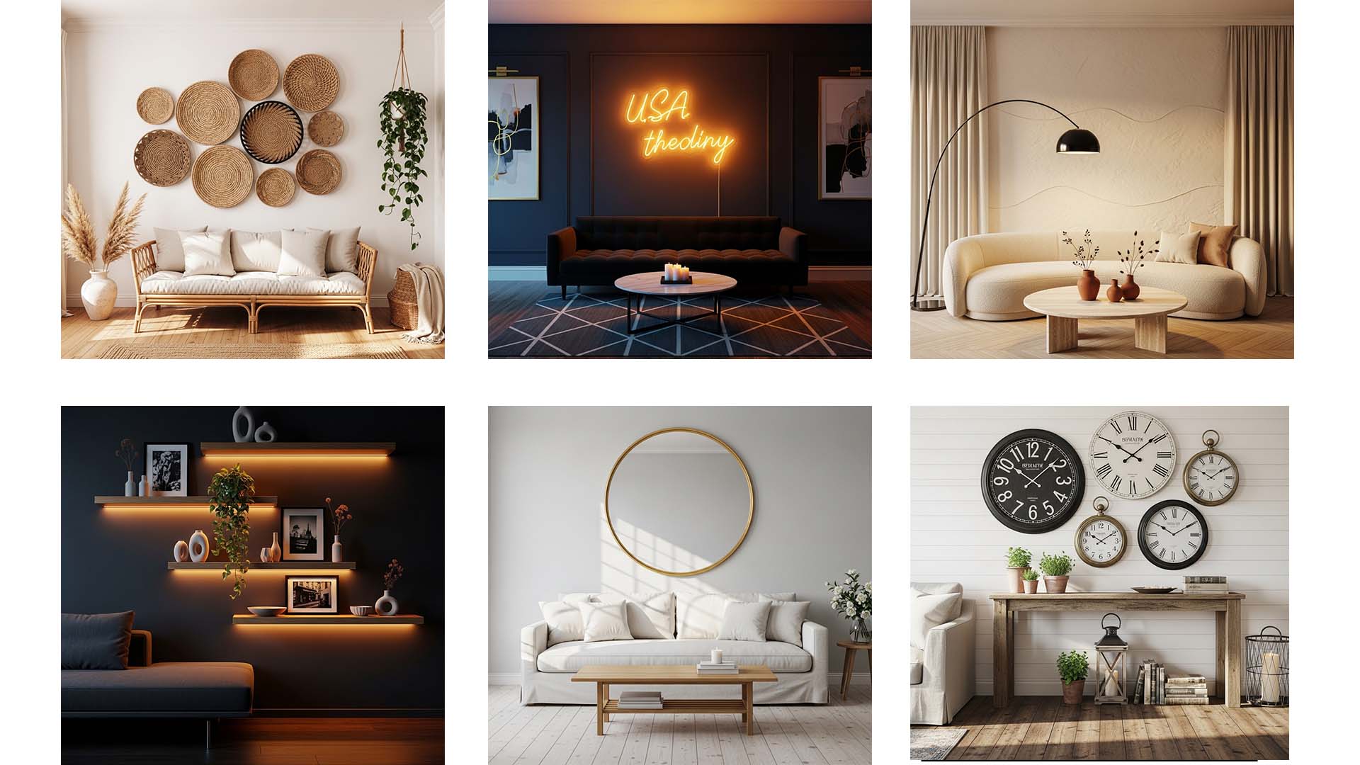
18. Cirular Woven Wall Basket Display
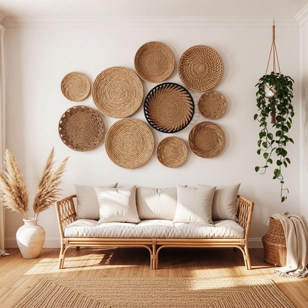
A cluster of circular woven baskets creates a wall display that adds texture, warmth, and dimension all without a single nail hole larger than a small picture hook. The organic arrangement of varying basket sizes mimics the natural asymmetry found in nature, making the wall feel collected and intentional rather than manufactured. This idea consistently earns high saves on home decor inspiration platforms.havenly
Mixing seagrass, jute, and rattan materials within the same arrangement adds visual variety without disrupting the earthy, natural tone of the collection. Natural color variations between materials create subtle contrast that keeps the eye moving across the whole display. I’ve seen this treatment make a small, plain living room wall feel like an artisan marketplace.
- Adds organic texture without heavy frames
- Mix sizes for natural visual movement
- Combines seagrass, jute, and rattan beautifully
- Works in boho and nature-inspired living rooms
- Lightweight and renter-friendly installation
Creating an asymmetrical arrangement rather than a rigid grid makes this display feel more organic and styled. Start with the largest basket at the center or slightly off-center, then build outward with smaller pieces. Step back after every addition to assess visual balance before hanging the next basket.
Basket walls also work as an alternative to gallery walls in rooms where artwork feels too formal or expected. The three-dimensional quality of the baskets creates genuine shadow and depth on the wall. This physical dimensionality is something flat printed art cannot achieve.
19. Framed Architectural Sketches
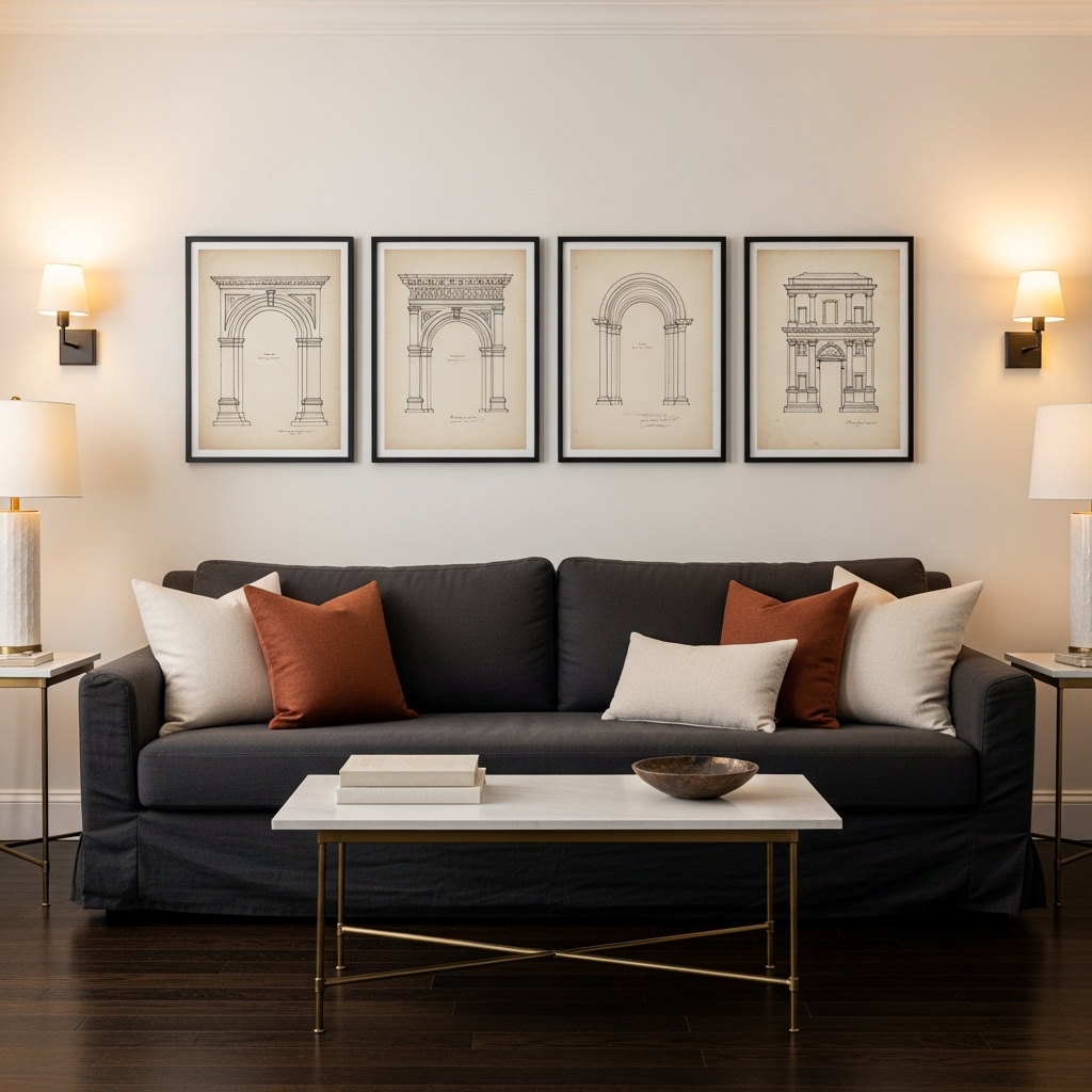
Framed architectural sketch prints bring a quiet, intellectual elegance to living room walls that feels collected and timeless. Fine ink drawings of classical facades, floor plans, and structural details photographed on aged cream paper carry the same refined quality as antique maps or botanical illustrations. This styling choice suits transitional, modern classic, and editorial-inspired home aesthetics.submaterial
The key to making this idea work is consistent framing with generous cream matting. Matte space around each drawing gives the eye room to appreciate the fine detail in the artwork. I’ve noticed that architectural prints without proper matting look like unframed photocopies rather than considered wall art.
- Adds intellectual and editorial wall character
- Works in a clean horizontal row arrangement
- Cream matting gives each print space to breathe
- Suits transitional and modern classic interiors
- Pairs beautifully with dark furniture and brass
Sourcing these prints is easier than most people expect. Architectural archives, vintage print sellers, and downloadable art shops all offer quality options at various price points. You can build an entire set of four matching prints for under fifty dollars using digital download options.
Hanging them in a precise horizontal line at eye level creates a clean, gallery-like structure. Using a level and measuring equal spacing between each frame produces a professionally installed result. This precision in placement is what separates a casual display from a truly designed wall.
20. Sage Green Shiplap Wall
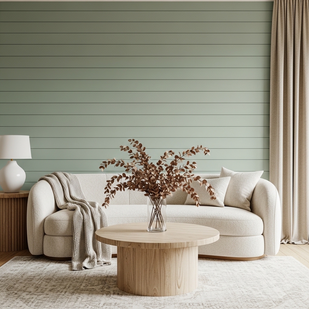
Sage green shiplap combines two of the most enduring home decor trends into one cohesive, calming wall treatment. The horizontal lines of shiplap boarding add subtle texture and dimension to the wall, while the sage green color brings an organic, nature-forward quality to the room. This pairing suits farmhouse, modern coastal, and cottage-style living rooms perfectly.architecturaldigest
Sage green is one of the most versatile accent wall colors available because it pairs naturally with cream, white, warm wood, and terracotta tones equally well. That flexibility means you can update your furniture and accessories over time without ever needing to repaint. I’ve recommended this color more than any other to clients who want a refresh that ages beautifully.
- Combines texture and color in one treatment
- Sage green pairs with nearly every neutral tone
- Works beautifully with boucle and linen furniture
- Farmhouse and modern coastal styles both benefit
- Horizontal boards make narrow rooms feel wider
Painting existing shiplap rather than installing new boards is a fast, cost-effective way to achieve this look. A single coat of quality eggshell paint in sage transforms raw or white boards completely. The eggshell sheen catches light better than flat paint and makes the horizontal lines more visible.
Pairing sage shiplap with cream furniture and dried botanicals creates a palette that feels naturally connected to the outdoors. Adding a single warm-toned accessory — a terracotta vase or a rust throw pillow — prevents the room from feeling too cool. This small warm accent is the detail that makes the whole room feel finished.
21. Brass Wall Sconce Pair
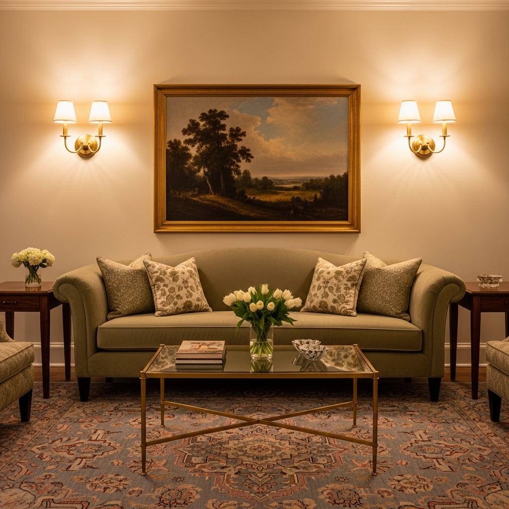
Wall sconces do double duty as both a lighting source and a genuine wall decor feature. A matched brass pair mounted symmetrically on either side of a painting creates a hotel-lobby quality that most living rooms simply never achieve. This approach adds warmth, symmetry, and ambient light in one deliberate styling move.
Symmetry on a wall signals intention and confidence in interior design. That’s why many stylists treat wall sconces as anchors that hold an entire wall composition together, not just as light sources. I’ve seen this single addition make a generic sofa wall look like it was professionally designed from the start.
- Creates warm ambient evening wall lighting
- Symmetrical placement signals intentional design
- Brass finish suits transitional and classic rooms
- Pairs beautifully with framed artwork above sofas
- Adds a hotel-quality feel to living room walls
Choosing sconces with linen or cotton shades softens the light beautifully compared to open-bulb designs. The shade diffuses the glow and creates a warm halo effect on the wall around each fixture. This diffused quality is far more flattering than direct exposed bulb light.
Hardwiring sconces looks the most polished but plug-in versions with fabric cord covers offer a rental-friendly alternative. Battery-operated brass sconces have also improved dramatically in recent years. Several options now include a warm dimming feature that makes them nearly indistinguishable from hardwired fixtures.
22. Chalkboard Paint Wall Panel
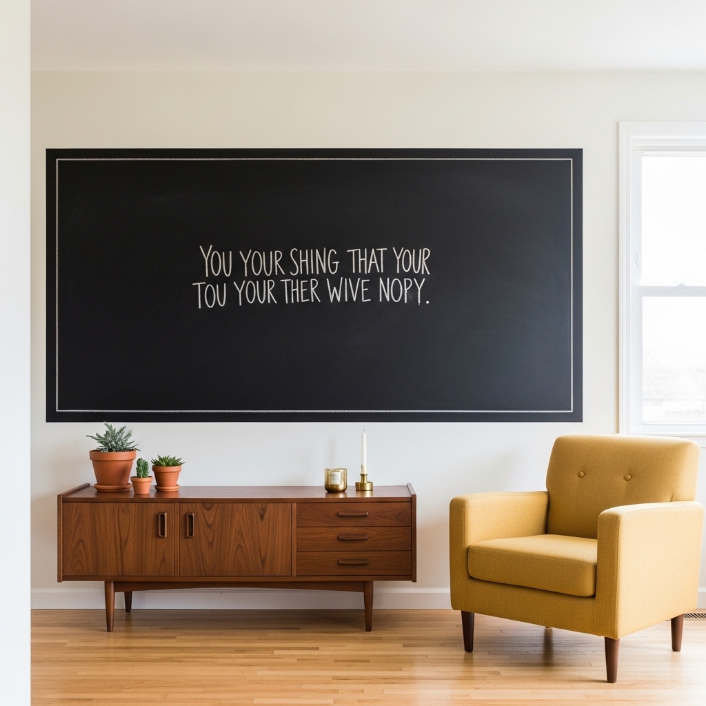
A chalkboard wall panel adds a living, changeable element to the room that no static artwork can match. You update the message, drawing, or seasonal quote as often as you like, which keeps the space feeling fresh without buying anything new. This idea suits creative households, renters, and anyone who loves a functional yet stylish wall feature.
The key is framing the chalkboard section with a thin molding border rather than leaving a raw painted rectangle on the wall. That frame transforms a painted patch into a deliberate design feature. I’ve noticed that the framed version always looks intentional, while an unframed patch always looks unfinished and accidental.
- Updates seasonally with new chalk messages
- Framing it makes the panel look deliberate
- Works as art, menu board, or quote display
- Suits creative and family-centered living rooms
- Rental-friendly with removable chalkboard panels
Positioning the panel at a height comfortable for writing and reading matters practically. Eye level for adults sits around 60 inches from the floor. Mounting the center of your panel at that height ensures it reads naturally without requiring any awkward neck angling.
Chalk markers rather than traditional chalk sticks produce cleaner, more defined lettering. They also resist smudging from accidental contact, which extends the life of each display. Seasonal quotes, monthly menus, and family reminders all look clean and intentional when written with chalk markers.
23. Maximalist Color Block Wall
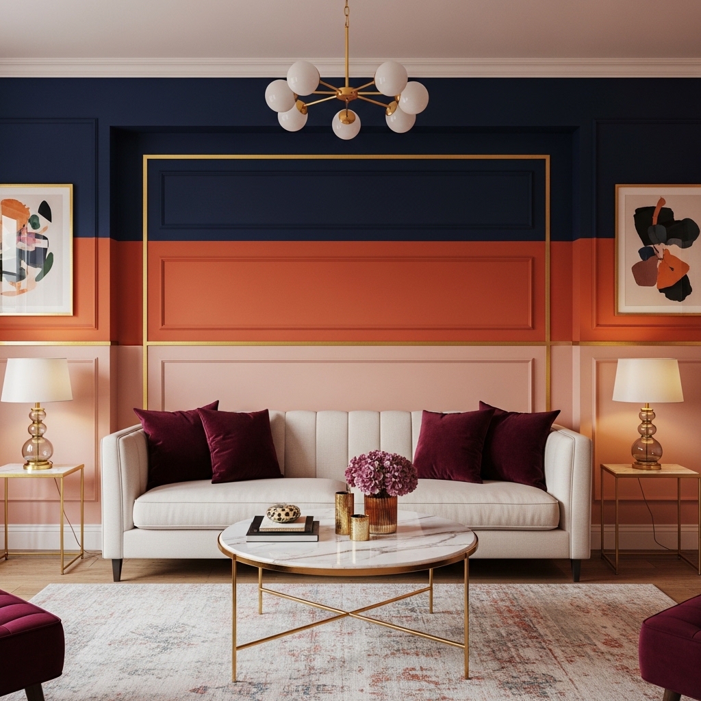
Color blocking on a living room wall creates a bold, artistic effect that turns a plain surface into an actual design statement. Dividing the wall into two or three horizontal or vertical color zones with thin molding separators produces a graphic, intentional quality that few other treatments achieve at low cost. This idea suits eclectic, maximalist, and design-forward living rooms.
Choosing colors from the same warm or cool family keeps the result cohesive even when using strong contrasting tones. Pairing deep navy, terracotta, and blush works because all three share warm undertones that connect them visually. I’ve tried random color combinations and they always create visual tension rather than visual interest.
- Creates a bold graphic wall statement
- Thin molding strips add precision and polish
- Colors from same family stay visually cohesive
- Suits eclectic and maximalist living spaces
- Budget-friendly with just paint and trim strips
The proportions of each color zone significantly affect the final result. Giving the darkest color the top third creates a dramatic overhead effect. Placing the lightest tone at the bottom grounds the room visually. This arrangement mirrors how light naturally falls in most spaces.
Extending the color blocks onto the ceiling edge of the darkest zone creates a cocooning effect that feels intentionally designed. This small extension adds architectural drama that makes the room feel custom-built rather than simply painted. It takes five extra minutes and makes an enormous visual difference.
24. Vintage Clock Wall Display
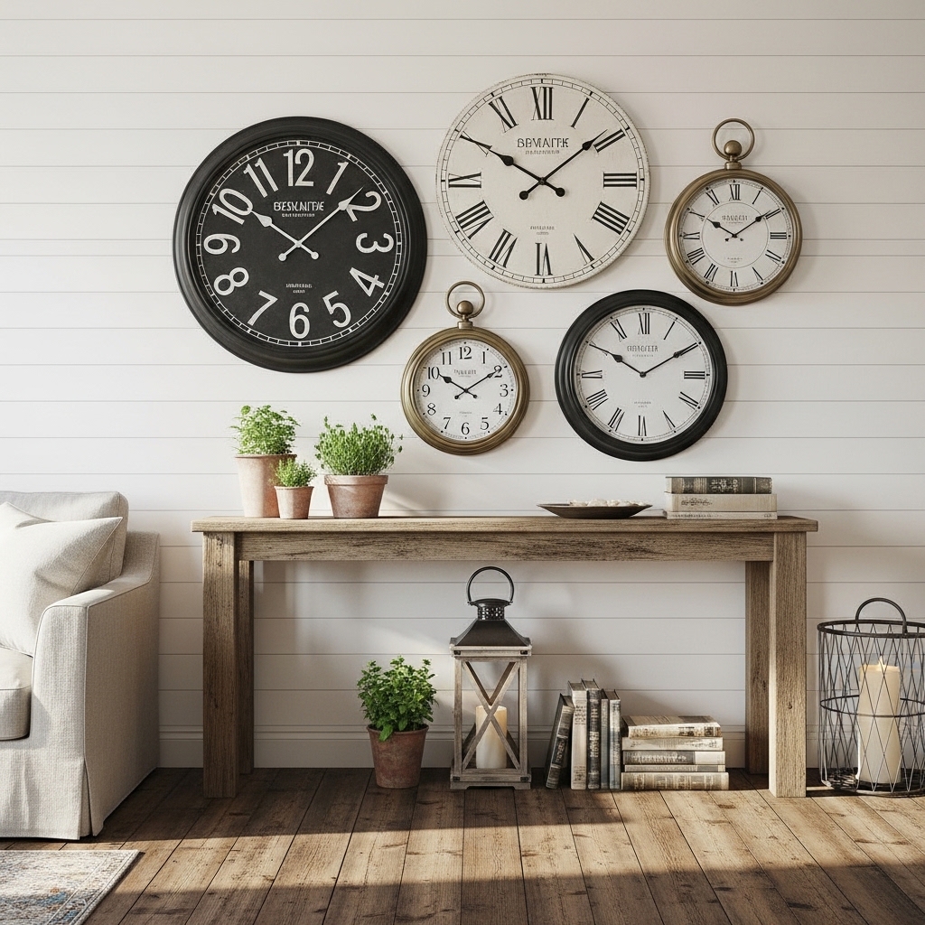
A curated collection of vintage clocks creates a wall display that feels genuinely collected over time rather than purchased as a set. The mix of shapes, sizes, and eras produces an organic visual story that mass-produced wall art simply cannot replicate. This idea works beautifully in farmhouse, rustic, and eclectic living rooms where character matters more than precision.
I’ve noticed that clock walls work best when at least one piece is significantly larger than the rest. That anchor clock draws the eye first and gives the composition a natural focal center. Without one dominant piece, the cluster can feel scattered and visually restless rather than carefully composed.
- Creates a collected, character-filled wall display
- Mix clock sizes for natural visual movement
- One large anchor clock centers the whole arrangement
- Suits farmhouse and rustic living room styles
- Functional art that also tells the actual time
Stopping the smaller clocks at the same displayed time creates a calm, intentional quality. Random times across multiple clock faces can feel chaotic and distracting. Setting every clock to the same time — or removing the batteries so they all stop at an aesthetically pleasing position — solves this issue completely.
Sourcing vintage clocks from thrift stores, estate sales, and online vintage marketplaces keeps costs very low. Many collectors build impressive clock walls for well under one hundred dollars total. The aged character of genuine vintage pieces always looks richer than reproduction farmhouse clocks bought new.
25. Gradient Ombre Accent Wall
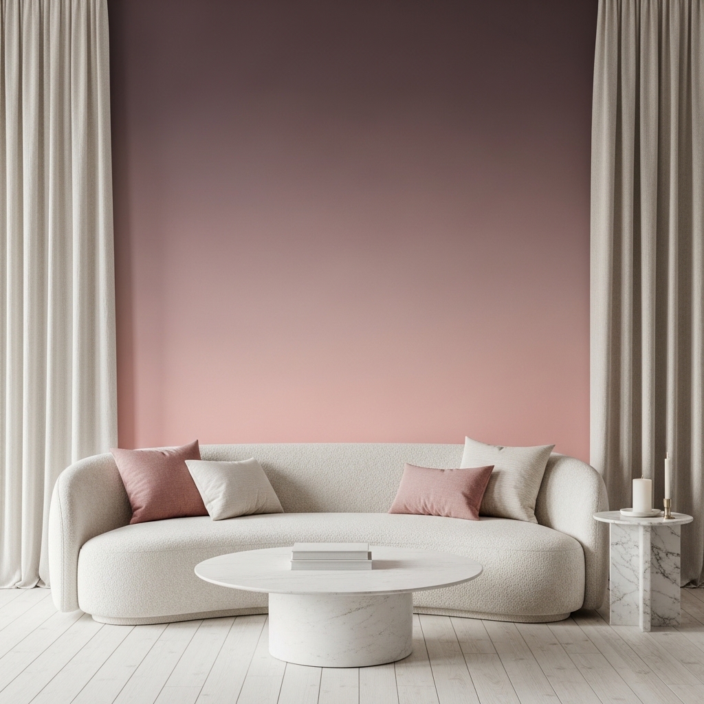
A gradient ombre wall creates a painterly softness that few other wall treatments can rival for romantic, dreamy living spaces. The color transition from deep to light — or light to deep — mimics the natural color movement found in sunsets, watercolors, and soft fabrics. This approach instantly makes a plain room feel artistically intentional and visually immersive.
Achieving a clean gradient requires blending while both paint layers are still wet. Working in sections of roughly twelve inches at a time and blending the transition zone with a dry brush creates a smooth, seamless fade. That’s why many painting tutorials recommend this exact technique for first-time ombre wall attempts.
- Creates a dreamy romantic wall atmosphere
- Blending while wet produces the cleanest gradient
- Works beautifully in pink, sage, and dusty blue tones
- Pairs naturally with boucle and linen furniture
- One accent wall is enough for full visual impact
Choosing two tones from the same color family — rather than two completely different colors — makes the blending process far easier. A deep dusty mauve fading into pale blush requires only three to four blending passes. Completely unrelated colors require much more careful work to avoid a muddy middle zone.
Photography of ombre walls in natural morning or afternoon light shows the gradient at its most beautiful. The directional light emphasizes the tonal shift in a way that flat interior lighting cannot. This is exactly why ombre accent walls perform so well on natural-light-heavy home inspiration platforms.
26. Pegboard Styled Display
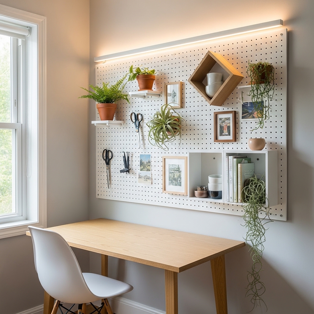
A styled pegboard turns an ordinary storage wall into a design feature that rewards creative arrangement and constant evolution. Every peg insert, shelf, and hook becomes a styling tool, making the pegboard as much a living decor installation as a functional organization system. This idea works especially well in living room home office areas where beauty and practicality must coexist.
The flexibility of pegboard styling means you never commit to a fixed arrangement. Rearranging the layout takes minutes and costs nothing. I’ve seen this quality make pegboard walls one of the most loved and long-lasting decor choices among people who redecorate frequently and enjoy hands-on styling work.
- Combines functional storage with wall styling
- Rearranges easily without any tools needed
- Works perfectly in home office living areas
- Adds plants, art, and objects all in one display
- Suits minimalist and modern eclectic styles
Painting the pegboard in a color that matches the wall behind it creates a seamless, built-in appearance. When the board disappears into the wall color, only the objects displayed on it stand out visually. This technique makes the whole arrangement look far more refined than a raw wood or unpainted board.
Adding a single row of warm LED strip lighting along the top edge of the pegboard transforms it into an ambient light feature at night. The soft glow highlights displayed objects and creates a gentle warm wash across the wall below. This detail takes pegboard styling from purely functional into genuinely atmospheric territory.
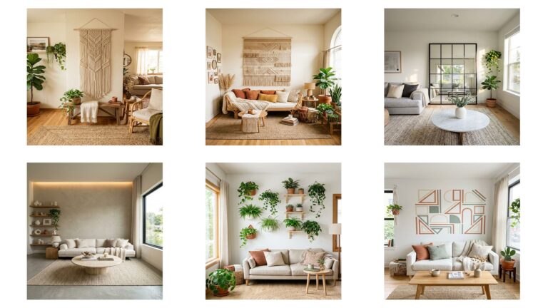
27. Macramé Statement Weave
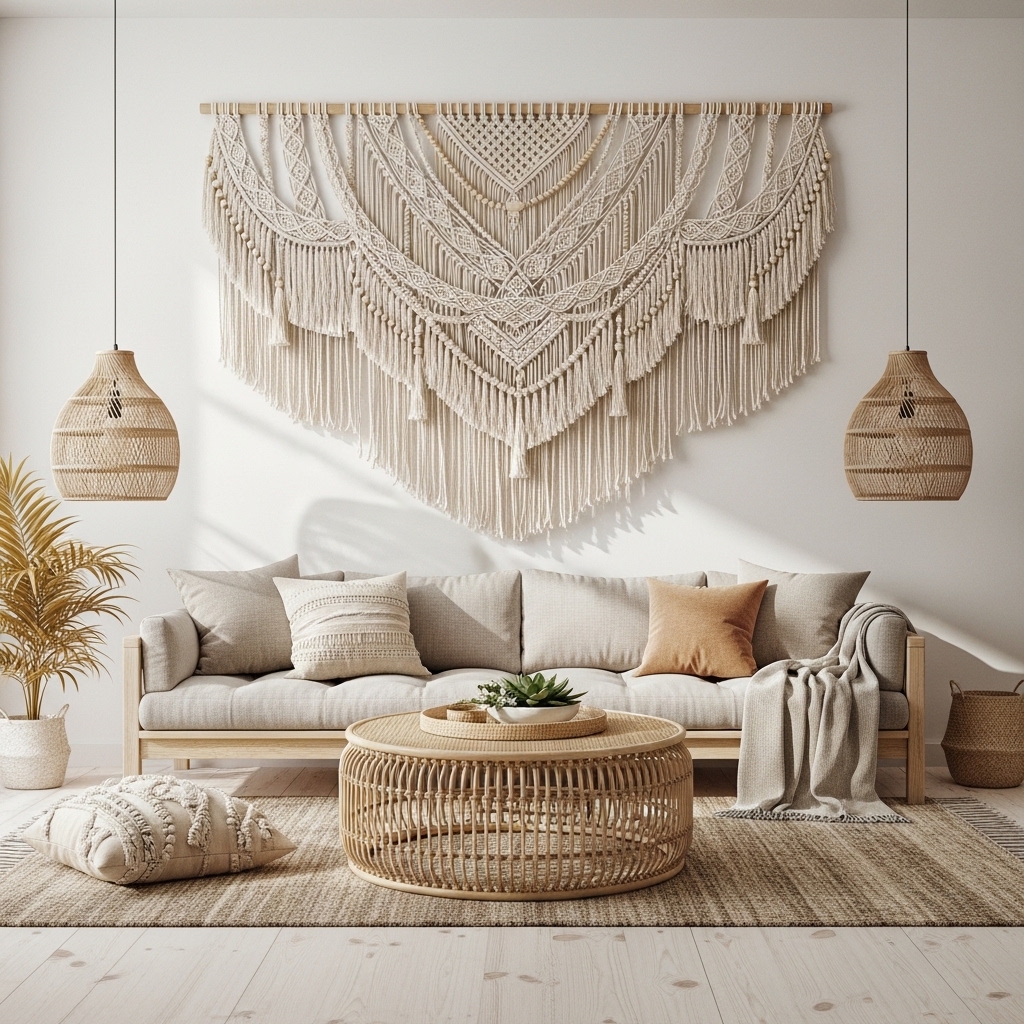
A large handmade macramé piece brings artisanal craft directly onto your wall in a way that adds texture, warmth, and visual softness without the rigidity of framed art. The knotted cotton rope creates dimensional shadow and physical depth that reads beautifully across different lighting conditions throughout the day. This styling choice suits bohemian, coastal, and nature-inspired living rooms.
Handmade macramé pieces carry an authenticity that mass-produced wall art simply lacks. Each knot variation and fringe length difference makes every piece slightly unique, which adds genuine character to the wall. That handcrafted quality is exactly what draws home decor audiences to this style consistently on visual platforms.
- Adds artisanal texture and handcrafted character
- Creates physical depth and dimensional shadow
- Works in coastal, boho, and natural styled rooms
- Pairs beautifully with rattan and linen furniture
- Lightweight and easy to hang on any wall
Scale matters enormously with macramé displays. A piece too small for its wall reads as a craft project rather than a design choice. Your macramé should span at least half your sofa width to hold its own visually on the wall behind it.
Pairing natural cotton macramé with wooden beads, dried botanicals tucked into the weave, and hanging feather or leaf accents adds layers of natural material interest. These additions deepen the earthy, organic quality of the piece and connect it visually to the room’s other natural textures.
28. Reclaimed Wood Art Panel
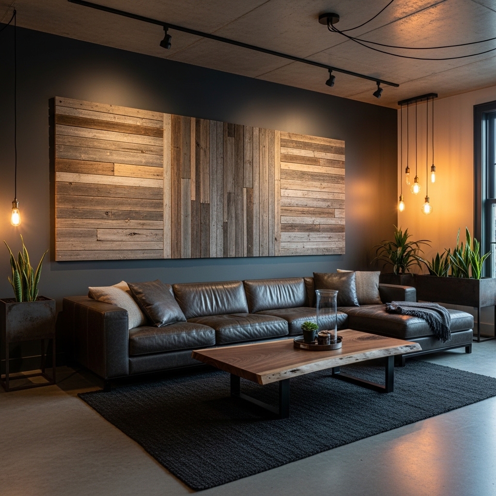
A reclaimed wood art panel brings raw materiality and environmental storytelling to a living room wall in one powerful installation. The weathered grain, aged color variation, and physical texture of genuine barn wood creates an irreplaceable surface quality that manufactured wood products cannot fully imitate. This look suits industrial, loft-style, and rustic-modern living rooms.
Reclaimed wood also carries an inherent sustainability story that resonates with modern homeowners. Choosing salvaged material over new lumber reduces waste and adds genuine provenance to the room. I’ve seen homeowners feel a real emotional connection to a reclaimed wood wall that standard building materials simply never create.
- Adds raw material depth to modern living walls
- Weathered tones create natural color variation
- Works as a TV wall or sofa backdrop feature
- Suits industrial loft and rustic modern styles
- Each panel carries genuine aged character
Arranging the planks in a herringbone or chevron pattern rather than simple horizontal rows adds geometric interest to the installation. The pattern transforms the wood from a surface treatment into an actual visual artwork. This extra step requires only careful planning at the layout stage before final mounting.
Sealing reclaimed wood with a clear matte oil preserves the weathered appearance while protecting the surface from dust and minor moisture. Avoid glossy sealers as they diminish the aged, matte quality that makes reclaimed wood so visually appealing. A single application of matte finishing oil is all the maintenance the wall ever needs.
29. Framed Fabric Textile Art
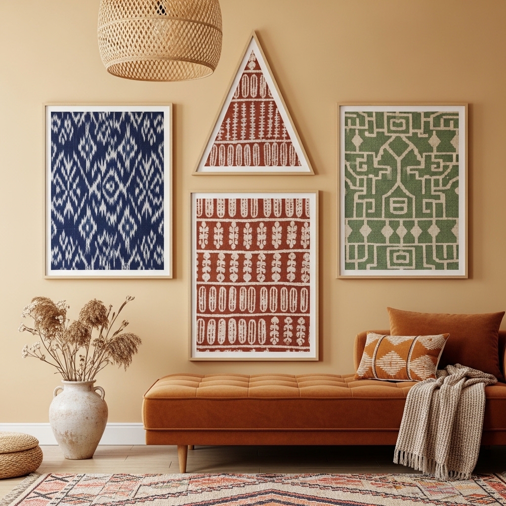
Framing woven or printed fabric as wall art creates a warmth and texture that paper-based prints cannot match. The physical weight and tactile quality of real textile prints gives them a presence on the wall that feels more like collected objects than standard art. This approach suits globally inspired, eclectic, and maximalist living rooms.
I’ve noticed that ikat, block print, and hand-woven textile patterns bring an immediate richness to neutral rooms that would otherwise require significant furniture investment to achieve. A single large framed textile in deep indigo or rust can anchor an entire room’s color story. That’s why many stylists recommend this approach for rooms that need personality fast.
- Adds textile warmth that paper prints lack
- Ikat and block print patterns anchor room color
- Suits eclectic and globally inspired styling
- Natural wood frames keep the look grounded
- Mix three patterns from the same color family
Stretching fabric over a canvas frame rather than using glass creates a more dimensional, gallery-wrapped appearance. The edges of the textile wrap around the canvas sides, which adds depth visible even from an angle. This mounting style looks more artistic and deliberate than fabric behind glass.
Choosing fabrics from the same warm or cool color family — even with very different patterns — creates a cohesive collection. Three fabrics in rust, indigo, and sage all share earthy undertones that connect them visually. That underlying color harmony is what makes a mixed-textile wall arrangement feel curated rather than random.
30. Neon Sign Wall Feature
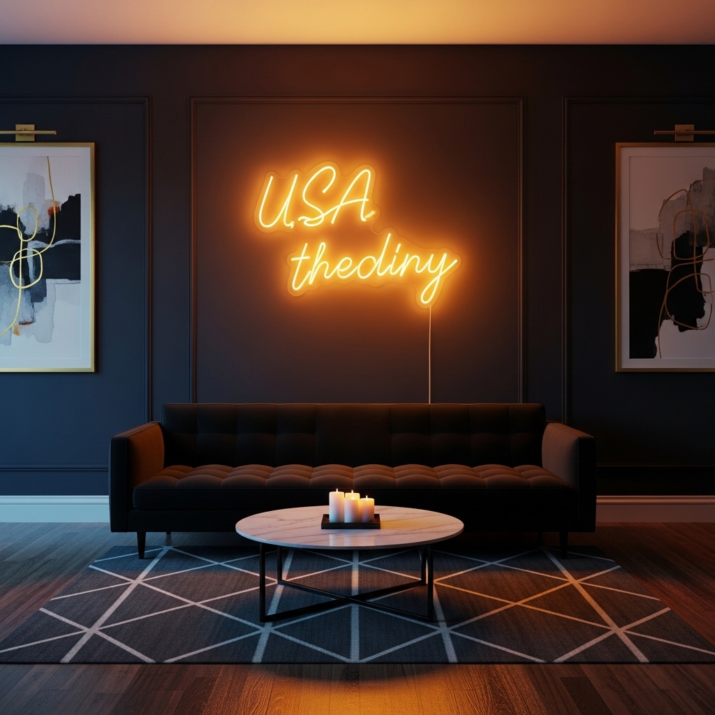
A custom neon sign adds personality, warmth, and a distinct point of view to a living room wall that no conventional decor choice can replicate. The soft glow of LED neon against a dark wall creates an ambient light source that makes the entire room feel more alive and intentional during evening hours. This idea suits modern, eclectic, and maximalist living rooms where personal expression matters.
Neon signs photograph dramatically in low-light conditions, making them one of the highest-performing home decor features on visual platforms. The warm glow creates a natural vignette effect that draws attention directly to the wall. I’ve seen single neon sign installations generate more engagement than entire gallery wall arrangements on home styling content.
- Creates warm ambient glow in evening spaces
- Adds personal expression to living room walls
- Photographs dramatically in low evening light
- Works as a focal point on dark accent walls
- LED neon versions stay cool and energy-efficient
Choosing LED neon rather than traditional glass neon eliminates heat and fragility concerns entirely. Modern LED neon strips bend into any shape or script and mount safely on any wall surface. They also consume a fraction of the energy that vintage glass neon tubes require.
Keeping the surrounding wall and furniture in darker, more neutral tones lets the neon sign claim full visual authority. A dark navy, charcoal, or forest green wall behind warm amber or pink neon creates a contrast that looks genuinely striking. This background choice is the single most important decision for making a neon wall feature work.
Conclusion
Your living room walls deserve far more than a single framed print hanging in an empty space. The 30 living room wall decor ideas in this article prove that luxury is not about budget — it is about intention, texture, and thoughtful styling choices. I’ve seen how the right wall treatment can completely shift the energy of a room and make the people inside it feel more at home. Start with one idea that excites you most. Hang that oversized mirror, apply that limewash finish, or build that floating shelf vignette. Share this article with a friend who needs a fresh room update, and save it on Pinterest so you always have it when inspiration strikes.
Frequently Asked Questions
How do I choose the right wall decor size for my living room?
Measure your sofa width first. Your wall art or arrangement should span at least two-thirds of that width. Going too small makes the piece look lost. A good rule is to aim for artwork between 24 and 48 inches wide for most standard living room walls.
What is the easiest living room wall decor idea for renters?
Peel-and-press wood slat panels, removable limewash wallpaper, and gallery walls using damage-free adhesive strips all work well in rentals. Leaning large mirrors against the wall also avoids drilling entirely. These options create a high-impact styled look without risking your security deposit.
How do I make a small living room wall look expensive?
Use one large-scale piece rather than many small ones. A single oversized mirror or statement canvas immediately makes a small wall feel curated and intentional. Adding warm lighting nearby amplifies the effect. Restraint and scale are the two qualities that make small walls look genuinely high-end.
What wall color works best behind a gallery wall arrangement?
Warm white, cream, and soft greige are the most reliable background colors for gallery walls. They let the frames and artwork stand forward without visual competition. Deep tones like navy or forest green also work beautifully if you want a more dramatic, moody gallery display effect.
How do I style floating shelves without making them look cluttered?
Follow the rule of three — one plant, one sculptural object, and one book stack or framed piece per shelf. Leave intentional empty space between each object. Empty space is not wasted space. It gives each item room to breathe and makes the whole arrangement feel carefully considered rather than crowded.
Can I mix different wall decor styles in the same living room?
Yes, but choose one unifying element to connect them. A consistent material — like brass hardware across all frames — or a shared color tone across all artwork keeps mixed styles feeling cohesive. Without one connecting thread, different decor styles compete rather than complement each other across the same wall space.
What type of lighting works best with wall decor?
Warm white lighting between 2700K and 3000K works best for most wall decor arrangements. Picture lights mounted above framed art, wall sconces flanking a focal piece, and recessed spotlights aimed at textured walls all dramatically improve how wall decor reads in the evening. Good lighting turns a nice wall into a stunning one.