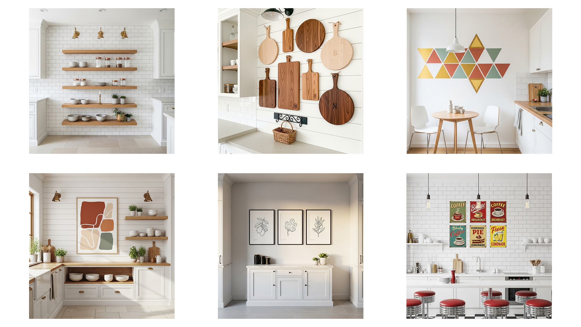
28 Kitchen Wall Decor Ideas That Look Expensive
Most kitchen walls sit completely empty while the rest of the room gets all the styling attention. You spend money on cabinets, countertops, and appliances — yet the walls stay plain, bare, and forgettable. Good kitchen wall decor ideas change that completely, and they cost far less than most people expect.
I’ve noticed that the kitchen is the one room where people feel the most uncertain about hanging art or styling walls. They worry about grease, steam, or choosing the wrong style for a functional space. That hesitation is completely understandable — but it’s also exactly what keeps most kitchens looking unfinished for years.
The truth is that a well-styled kitchen wall transforms how the entire room feels. It creates warmth, personality, and a sense of intention that makes cooking more enjoyable and entertaining more memorable. Interior stylists and experienced home decorators consistently treat the kitchen walls as a priority — not an afterthought — because the visual difference a styled wall makes is immediate and dramatic.
This article covers 28 distinct kitchen wall treatments that look genuinely expensive. From oversized botanical art and handmade zellige tile backsplashes to open shelf vignettes, limewash walls, and framed tea towel art — every idea here suits real homes, real budgets, and real kitchens. Whether your space is a compact apartment kitchen or a large farmhouse cooking room, you will find multiple ideas that work beautifully for your specific walls. Start reading, start saving, and start decorating.
1. Oversized Kitchen Art
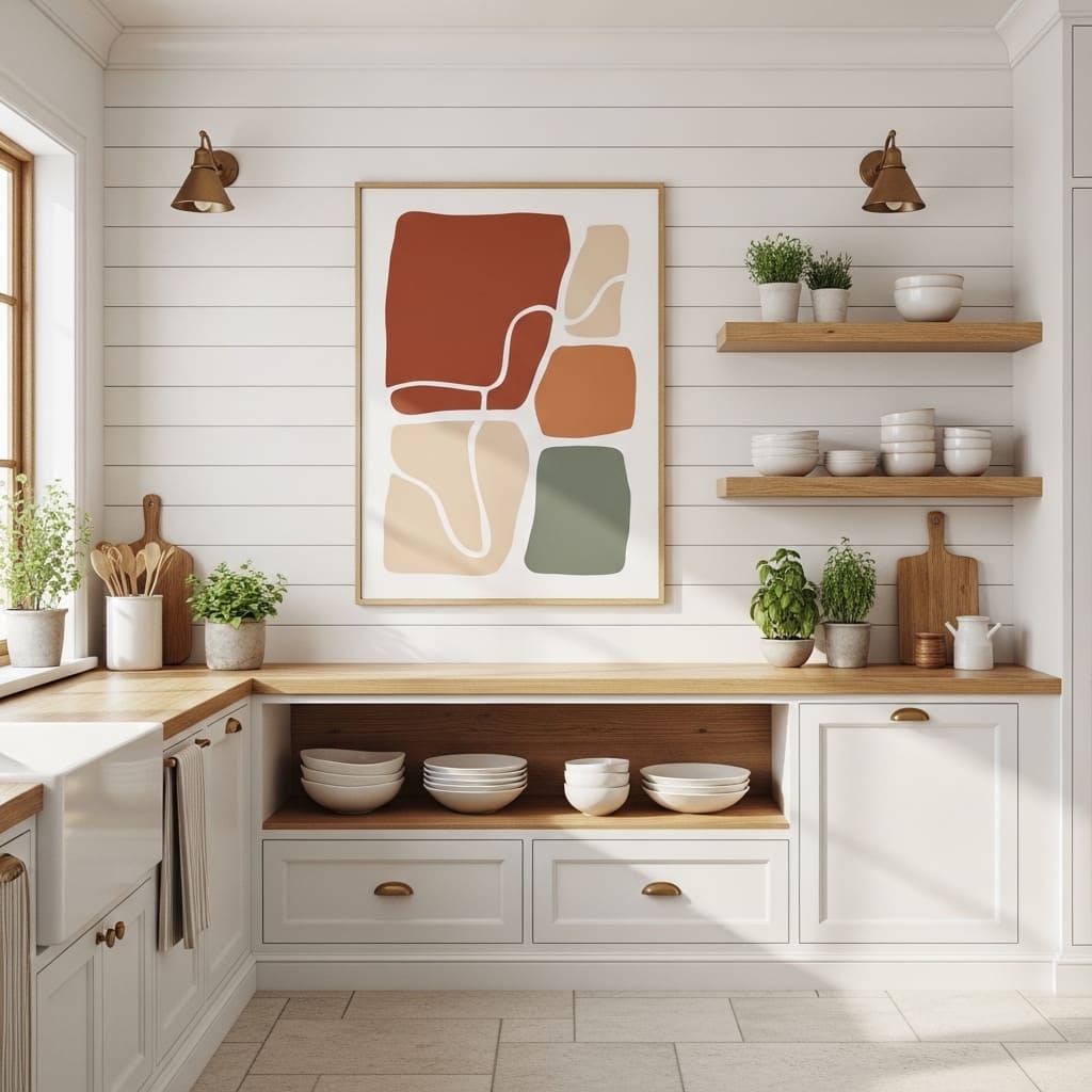
One large painting on a kitchen wall does more decorating work than a dozen small prints ever could. A single oversized piece instantly anchors the space and makes the room feel intentionally styled rather than casually assembled. This approach works beautifully in kitchens with wide empty walls above open shelving or beside cabinetry runs.
The key to making this idea work lies in choosing the right proportions. Your art piece should measure at least 24 by 30 inches to hold visual weight on a standard kitchen wall. I’ve noticed that undersized art above an open shelf always looks timid, while a properly scaled piece looks bold and confident.
- Single large art anchors kitchen walls beautifully
- Warm abstract tones suit most kitchen palettes
- Works above open shelves or beside cabinetry
- Oversized prints look genuinely expensive fast
- Botanical and abstract styles suit modern farmhouse
Choosing art in warm terracotta, sage, or cream tones coordinates naturally with wood, stone, and linen kitchen textures. These earthy tones photograph beautifully in natural morning light, which makes them ideal for kitchens that face east or south. That photographic quality is exactly why oversized kitchen art earns such high engagement on home inspiration platforms.
Framing large prints in thin brass or natural oak makes the art feel more luxurious than the print itself might suggest. The frame quality often determines whether artwork reads as expensive or affordable at first glance. A quality frame around a budget print consistently outperforms a cheap frame around an expensive one.
2. Open Shelf Vignette Wall
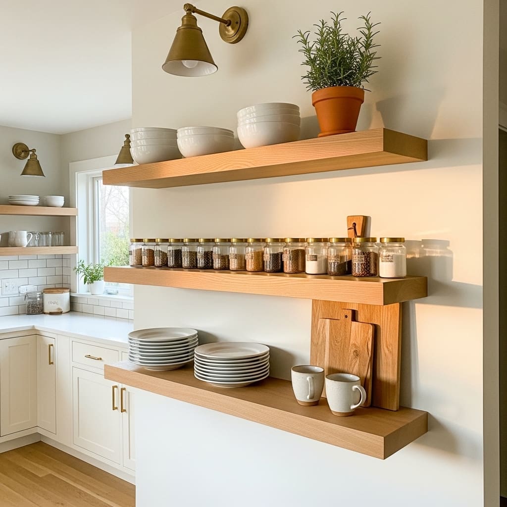
Open kitchen shelves styled as living vignettes turn purely functional storage into genuine wall decor. When everyday kitchen items — ceramic plates, glass jars, cutting boards, and potted herbs — are arranged with intention, the entire wall becomes a curated display that tells a story about how the kitchen is used and loved. This idea works perfectly in transitional, farmhouse, and modern classic kitchens.
That’s why many interior designers now treat open shelving as the primary decor strategy for kitchen walls rather than art alone. Functional objects displayed beautifully have a practical authenticity that wall prints cannot match. I’ve seen this approach make even very small rental kitchens feel genuinely designed and personally curated.
- Stacked ceramic plates look styled and functional
- Glass spice jars with brass lids add visual detail
- Fresh herbs in small pots bring organic life
- Cutting boards leaned vertically add warm wood texture
- Brass shelf brackets add a luxurious finishing detail
The rule of three applies beautifully to open shelf styling. Each shelf performs best when it holds one functional group, one organic element, and one decorative object. For example — stacked plates, a small plant, and a single ceramic vase — covers all three categories on one shelf naturally.
Leaving deliberate empty space on each shelf prevents the common mistake of overcrowding. Overcrowded shelves look like storage rather than styling. The visual breathing room between objects is what signals intentional curation rather than practical necessity. That restraint is the defining quality of shelves that look genuinely expensive.
3. Decorative Plate Wall
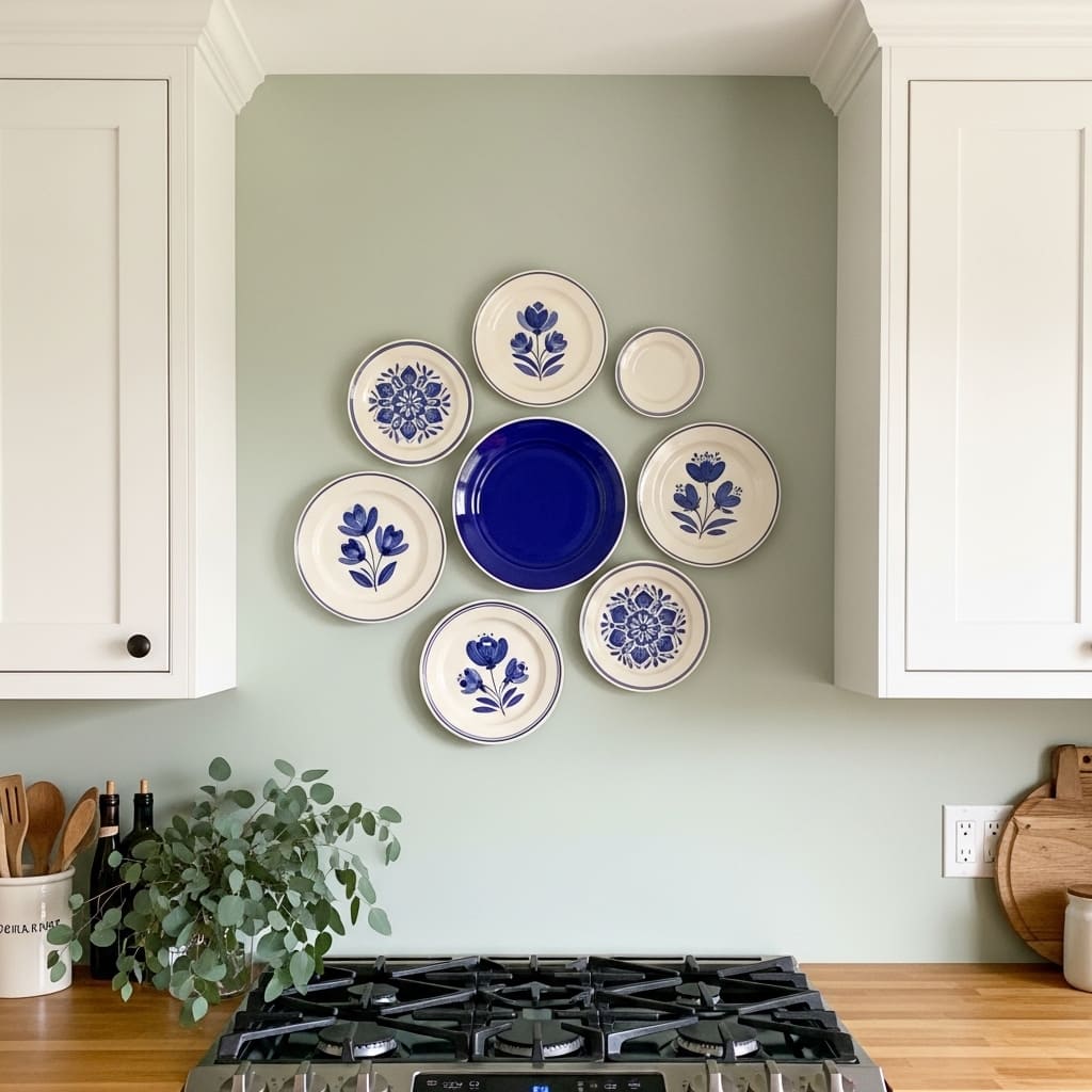
A curated plate wall brings handcrafted artisanal character to a kitchen that no printed artwork can fully replicate. The mix of sizes, glaze finishes, and painted patterns within a single collection creates a dimensional, textured display that catches light and draws attention naturally. This decor idea suits cottage, Mediterranean, and eclectic kitchen styles.
Choosing plates from the same color family — blues and whites, or earthy creams and terracottas — creates visual cohesion across the arrangement even when the plates themselves are completely different in size and pattern. That color thread is what connects a diverse collection into a single composed display. I’ve seen plate walls styled this way become the most commented-on detail in an entire kitchen.
- Mix plate sizes for natural visual movement
- One bold color plate anchors the whole arrangement
- Works in cottage, eclectic, and Mediterranean kitchens
- Hand-painted plates add genuine artisanal character
- Sage green walls complement blue and cream plates
Starting the arrangement with the largest plate at the visual center and building outward with smaller pieces creates a natural, organic composition. Laying the arrangement out on the floor first before committing to wall placement saves enormous amounts of time and prevents unnecessary patching work.
Plate hangers with adhesive backing make installation damage-free in most cases. This practical detail makes a decorative plate wall renter-friendly, which significantly expands the audience for this decor idea. Removing the hangers leaves minimal marks that most landlords accept as standard wear.
4. Handmade Tile Backsplash Art
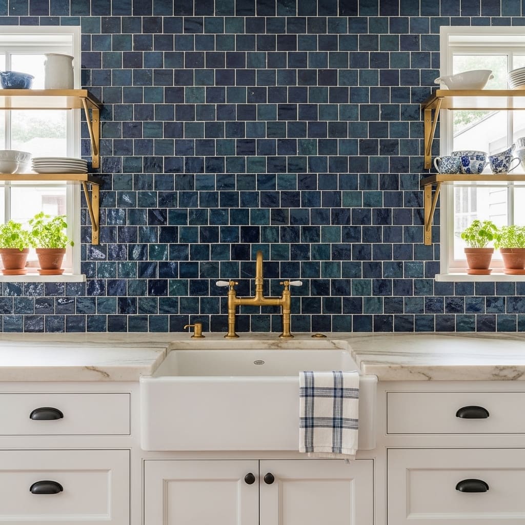
Handmade zellige tiles used as a full backsplash wall create a kitchen feature that looks and feels genuinely luxurious because each tile is slightly unique. The slight variation in color and glaze across handmade tiles produces a shimmering, mosaic-like surface that manufactured tiles cannot match. This kitchen wall treatment suits Mediterranean, coastal, and eclectic interiors.
Deep blue and turquoise zellige tiles against white cabinetry create one of the most striking color contrasts available in kitchen design. The cool blue surface reflects natural light in constantly shifting patterns throughout the day. That visual dynamism makes a zellige backsplash wall feel alive rather than static — a quality that makes it one of the most saved kitchen decor treatments on inspiration platforms.
- Handmade tiles create unique shimmering surface variation
- Deep blue tones complement brass fixtures beautifully
- Zellige suits Mediterranean and coastal kitchen styles
- Full-wall backsplash creates maximum visual impact
- Each tile’s uniqueness adds genuine artisanal character
Brass bridge faucets and brass open shelf brackets pair with zellige tiles in a way that feels historically authentic. The warm metal tone echoes the amber and gold flecks within the tile glaze. That material harmony between warm brass and cool blue tile is exactly what gives this kitchen treatment its high-end, curated quality.
Sealing zellige tiles with a penetrating stone sealer protects the slightly porous surface from cooking grease and water splashes. This maintenance step is essential for the long-term beauty of handmade tiles in a cooking environment. Professional tile installers always recommend sealing immediately after grouting and reapplying annually for best protection.
5. Chalkboard Kitchen Wall
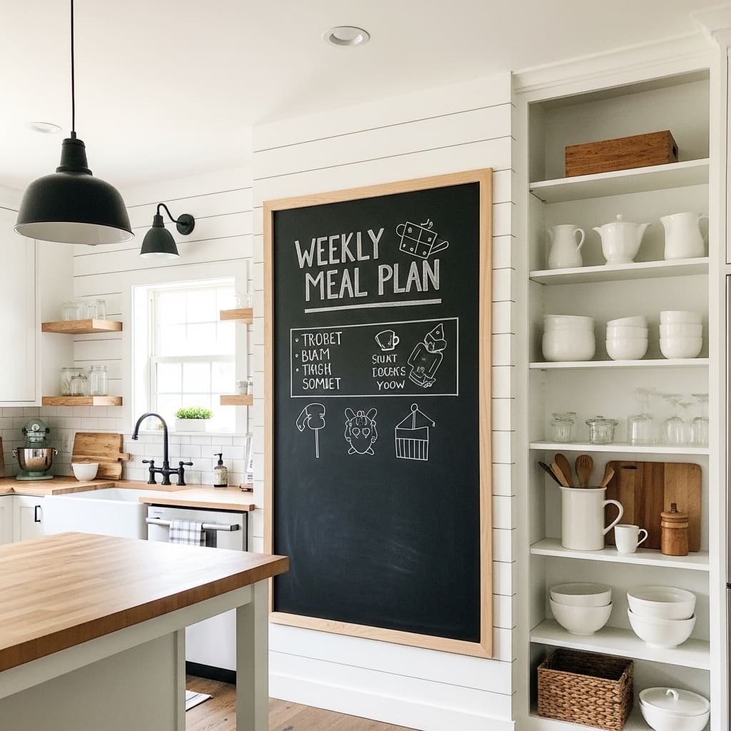
A chalkboard wall panel in a kitchen is one of the most practical and visually charming kitchen wall decor ideas for family homes. It provides a constantly changing canvas for meal plans, shopping lists, seasonal messages, and playful drawings that keep the kitchen feeling active and personally lived-in. This treatment suits farmhouse, casual modern, and family-centered kitchens.
Framing the chalkboard section with a thin black wood border elevates the painted panel from a practical surface to a deliberate design feature. Without that frame, a chalkboard patch on a wall looks unfinished. With it, the panel reads as a purposeful architectural element. That simple addition of trim costs very little and makes an enormous visual difference.
- Framed chalkboard looks designed, not functional only
- Weekly meal plans keep the kitchen wall content fresh
- Works in farmhouse and family-centered kitchen styles
- Chalk markers produce cleaner, smudge-resistant lettering
- Renter-friendly peel-and-stick chalkboard panels available
Chalk marker pens rather than traditional chalk sticks keep lettering clean, crisp, and smudge-resistant for longer periods. The cleaner lettering quality makes the displayed content look more intentional and designed. This small practical upgrade significantly improves how the chalkboard wall reads from across the kitchen.
Positioning the chalkboard panel beside the refrigerator or near the kitchen entrance maximizes its practical usefulness. Family members can update shopping lists, leave notes, and read the week’s meal plan without disrupting meal preparation in the main cooking zone. That functional placement makes the decor choice work harder for everyday household life.
6. Vintage Botanical Print Wall
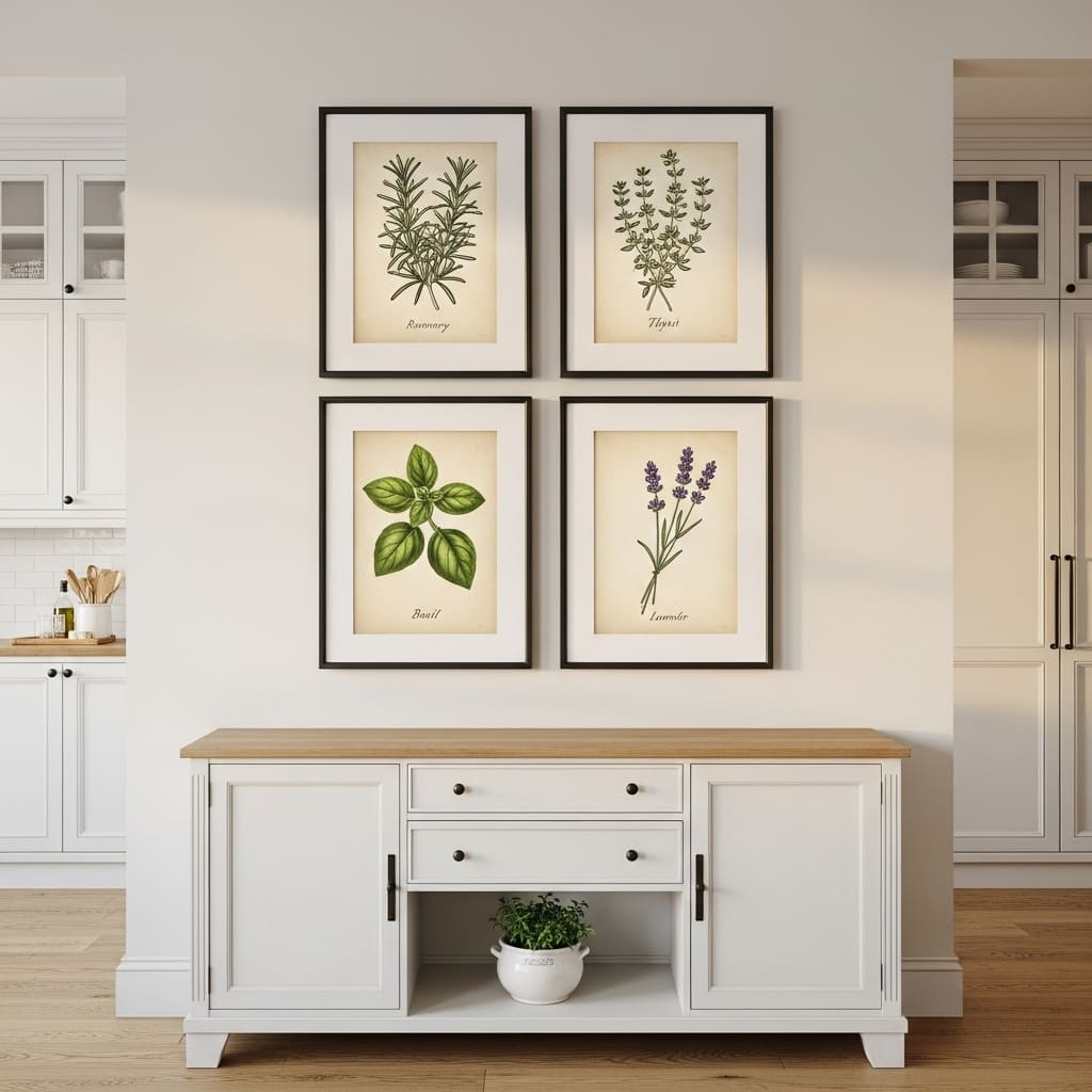
Vintage botanical herb prints are one of the most naturally appropriate wall decor choices for a kitchen because they connect the room’s primary purpose — food and cooking — with beautiful illustration art. Fine ink drawings of rosemary, thyme, basil, and lavender in aged cream paper frames feel collected and timeless rather than trend-dependent. This approach suits transitional, modern classic, and cottage kitchen styles.
The symmetrical two-by-two grid arrangement gives this display a clean, gallery-quality structure that feels professionally installed. Using identical frames across all four prints creates visual uniformity that ties the collection together even when the botanical subjects within each frame differ. That disciplined consistency is what makes a grouped art display look expensive rather than casual.
- Herb illustrations connect art directly to kitchen purpose
- Matching black frames unify four different botanical prints
- Wide cream matting adds gallery-quality breathing space
- Works in transitional, cottage, and modern classic kitchens
- Aged paper tones photograph beautifully in natural light
Sourcing these prints from digital download shops and printing them locally costs significantly less than purchasing pre-framed sets. A complete set of four botanical prints in matching frames costs under sixty dollars when self-assembled from quality digital sources. The result looks identical to sets priced at three to four times that amount in home decor stores.
Positioning the botanical print grid in the kitchen dining area or beside the breakfast nook rather than directly above the stove protects the frames from grease and steam. Kitchen art placed too close to active cooking areas accumulates surface residue that dulls the frames and stains the mats over time. Smart placement preserves both the art and the investment.
7. Rustic Pot Rack Wall
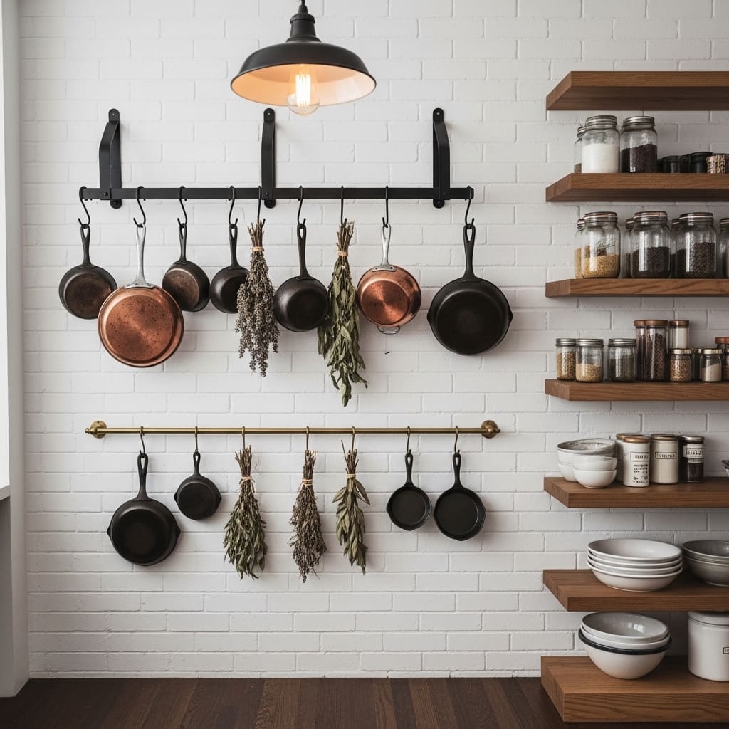
A wall-mounted pot rack turns everyday cooking equipment into a genuine kitchen wall feature that looks like it belongs in a professional chef’s studio. Copper and cast-iron pans hanging from iron hooks create a layered, dimensional wall display that no printed artwork can replicate in a cooking space. This approach suits rustic, industrial, and farmhouse kitchen styles.
Hanging dried herb bundles between the pans adds an organic, fragrant layer to the display that connects the visual arrangement to the actual act of cooking. Lavender, rosemary, and thyme bundles tied with natural twine cost almost nothing and dry beautifully while adding texture and natural scent to the wall. I’ve noticed this detail consistently transforms a pot rack from purely functional into genuinely beautiful.
- Copper pans create warm metallic kitchen wall interest
- Dried herb bundles add organic texture between pans
- Cast iron pans add dark contrast and visual weight
- Iron S-hooks keep the industrial aesthetic cohesive
- Works in rustic, farmhouse, and professional kitchen styles
Choosing a black iron or dark wrought iron rack suits both rustic and modern industrial kitchens equally well. The dark metal tone contrasts beautifully against white or brick walls and complements the warm copper and brown tones of the hanging cookware. That material combination creates a wall display that looks curated rather than simply utilitarian.
Positioning the pot rack at a height where the longest pan hangs comfortably above counter height prevents constant head bumping during meal preparation. Most kitchen designers recommend mounting the rack base at a minimum of 84 inches from the floor. This practical height requirement also creates a visually impressive vertical arrangement when properly positioned above a preparation surface.
8. Shiplap Kitchen Accent Wall
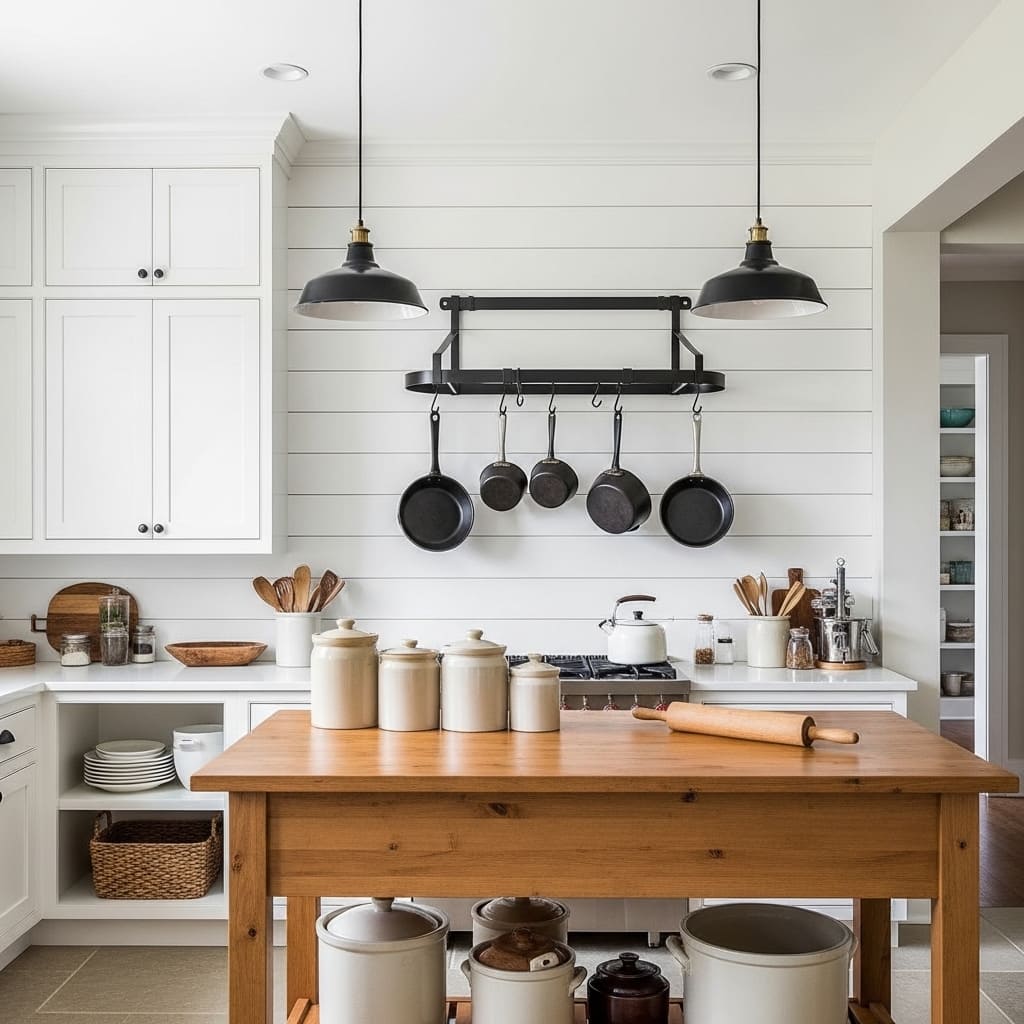
White horizontal shiplap on a kitchen accent wall creates the most iconic modern farmhouse kitchen backdrop available. The horizontal board texture adds depth and architectural interest while keeping the wall feeling bright, open, and airy. This treatment works beautifully behind kitchen islands, beside open shelving runs, and along dining area walls within open-plan kitchen layouts.
Shiplap also provides a highly practical surface for mounting wall hooks, pot racks, and open shelving directly through the boards into wall studs. That structural reliability makes shiplap more versatile as a functional kitchen wall treatment than standard painted drywall. The boards give you multiple anchor points across the full wall surface for hanging functional and decorative items.
- Horizontal boards add farmhouse depth to plain walls
- White shiplap stays bright and airy in small kitchens
- Works behind kitchen islands as a strong backdrop
- Provides sturdy mounting surface for wall-hung items
- Pairs beautifully with black hardware and warm wood
Painting shiplap boards in warm white rather than bright white prevents the farmhouse look from feeling overly stark. Warm white tones like alabaster or antique white coordinate naturally with natural wood, linen, and stone kitchen materials. That color warmth makes the kitchen feel inviting during both daytime cooking and evening entertaining.
Adding a cast iron pot rack or a row of black iron hooks directly on the shiplap wall turns the decorative surface into a functional workspace extension. This combination of beauty and practicality is the core principle that makes farmhouse kitchen design so enduringly popular. The room looks styled and works hard at the same time.
9. Large Kitchen Clock
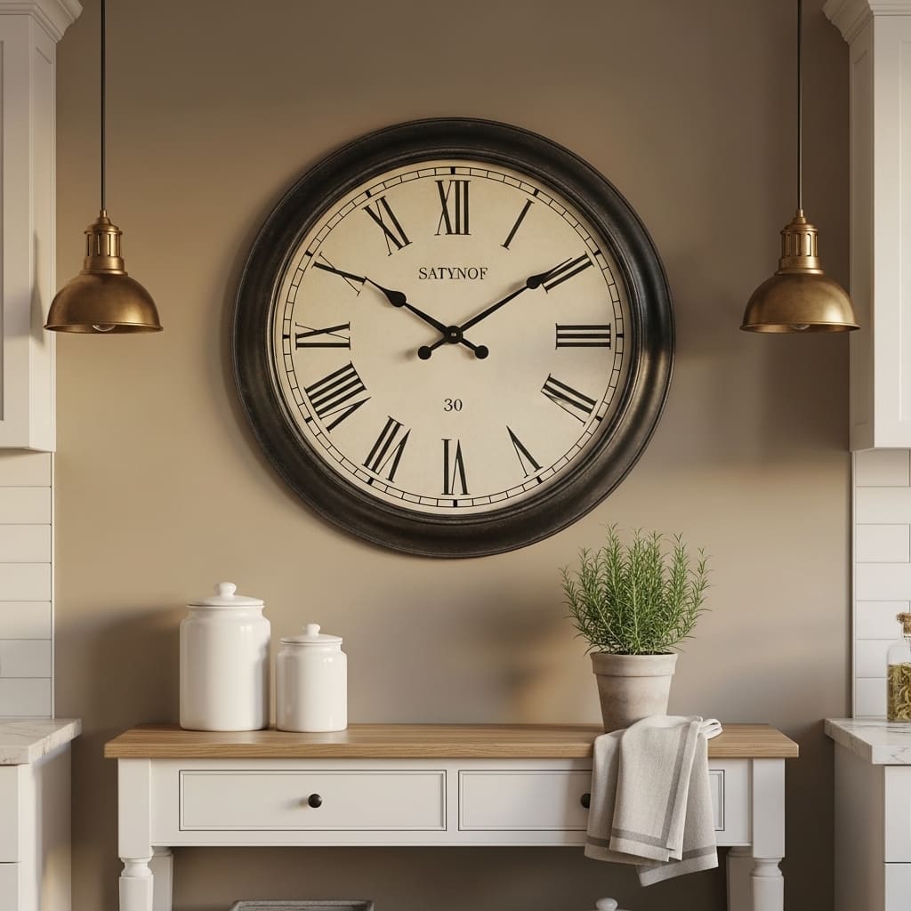
An oversized round clock hung on a kitchen wall works as both a practical daily tool and a genuine decorative statement. At 28 to 36 inches in diameter, a large clock carries enough visual weight to anchor an entire kitchen wall section without requiring any additional art or accessories. This approach suits transitional, traditional, and modern farmhouse kitchens.
The aged black metal finish of a large kitchen clock adds a masculine, industrial edge to kitchens that might otherwise feel overly soft or domestic. That contrast between the bold metal clock face and soft kitchen materials like linen, ceramic, and white cabinetry creates a visual tension that keeps the room feeling designed rather than predictable. I’ve recommended this decor idea to clients who wanted a strong focal point without committing to art or shelving installation.
- Oversized clock anchors a kitchen wall independently
- Aged black metal adds industrial edge to soft kitchens
- Roman numeral face adds classic, timeless character
- Works in transitional and modern farmhouse kitchens
- 30-inch diameter creates sufficient wall visual weight
Positioning a large clock above a console table or kitchen sideboard creates a complete vignette that connects the wall art to the surface below. Two matching accessories on the console — ceramic canisters, a small plant, or a folded linen towel — ground the clock visually and complete the wall arrangement. That connection between the wall piece and the surface below is what makes a single clock look like a designed vignette rather than an isolated object.
Choosing a clock with a sweep second hand rather than a ticking mechanism keeps the kitchen quieter during meal preparation and relaxed morning routines. Silent clock movements are now widely available at all price points. This practical consideration is one most people overlook when purchasing kitchen wall clocks purely for their visual appearance.
10. Framed Recipe Card Display
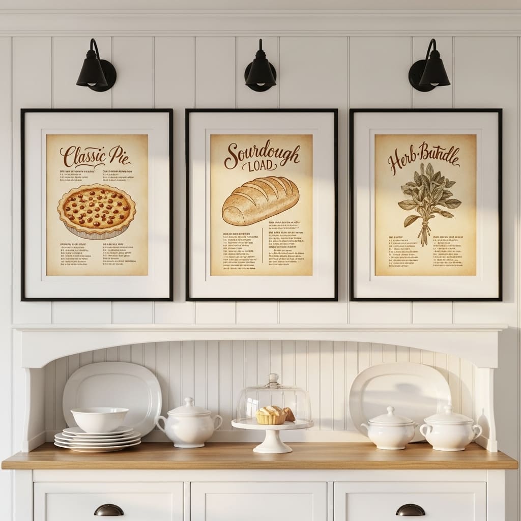
Framed vintage recipe cards or hand-lettered cooking illustrations bring a deeply personal and kitchen-specific quality to wall decor that generic abstract art simply cannot match. The connection between the art subject — a beloved pie recipe, a sourdough formula, a herb harvest guide — and the room in which it hangs creates an authenticity that makes guests stop and lean in for a closer look. This idea suits cottage, farmhouse, and warm traditional kitchen styles.
Hand-lettered recipe art available from independent artists and digital shops costs far less than original paintings while carrying the same personal, artisanal quality. Many homeowners commission a custom lettered version of a family recipe for this exact display purpose. I’ve seen that personal provenance — knowing the displayed recipe belonged to a grandmother or was developed in this very kitchen — make visitors genuinely emotional about a piece of wall art.
- Family recipe lettering adds deeply personal wall character
- Sepia ink on aged paper creates timeless vintage quality
- Wide cream matting gives each frame gallery-quality space
- Works in cottage, farmhouse, and traditional kitchens
- Three-frame horizontal row creates clean balanced display
Choosing subjects that directly reference the kitchen’s purpose — bread, pies, preserves, or herbs — grounds the art in the room’s identity. Kitchen art that references cooking feels intentionally placed rather than arbitrarily hung. That thematic connection between the room and its wall decor is a subtle but powerful quality that experienced home stylists use consistently.
Commissioning custom lettered pieces from independent calligraphy artists on creative marketplaces typically costs between forty and ninety dollars per piece. At that price point, three custom framed recipe illustrations cost less than a single piece of mass-produced wall art from a large home decor chain. The custom result is simultaneously more affordable and more personally meaningful.
11. Limewash Kitchen Wall
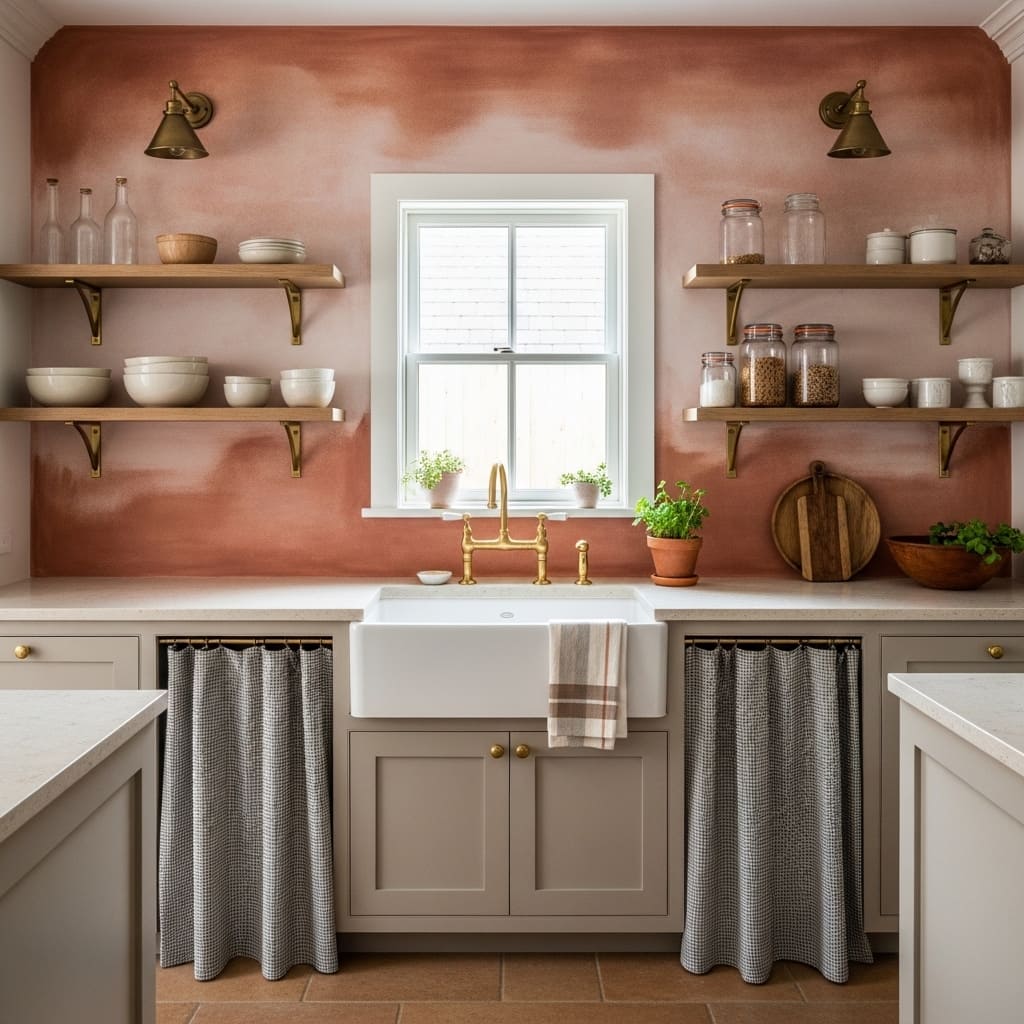
Limewash paint behind a kitchen sink creates a wall finish that looks hand-applied, aged, and genuinely artisanal in a way that standard paint never achieves. The layered mineral pigments produce a surface that shifts between dusty rose and warm clay depending on where the light falls. This organic quality makes limewash one of the richest and most characterful kitchen wall treatments available.
The warm terracotta tones of limewash suit kitchens with natural stone countertops, brass fixtures, and cream cabinetry particularly well. Each of these materials shares warm undertones that connect them into a cohesive, earthy palette. I’ve noticed that when all the warm tones in a kitchen — stone, brass, terracotta — share the same temperature, the room feels deliberately designed rather than accidentally assembled.
- Limewash adds aged artisanal depth to kitchen walls
- Tonal shifts with light keep the surface visually alive
- Warm terracotta pairs beautifully with brass fixtures
- Works in Mediterranean and farmhouse kitchen styles
- DIY application suits confident beginner decorators
Applying limewash yourself requires only a thick natural bristle brush and loose, circular strokes in two thin coats. The imperfections in hand application actually improve the final result rather than diminishing it. That forgiving quality makes limewash one of the most beginner-friendly ways to achieve a genuinely expensive-looking kitchen wall finish.
Limewash behind a kitchen sink also performs practically because the mineral-based finish resists minor water splashes better than standard latex wall paint. The natural composition of lime products provides a slight moisture tolerance that suits damp kitchen environments. A sealing coat of clear matte wax after application further improves the wall’s resistance to kitchen splashes and steam.
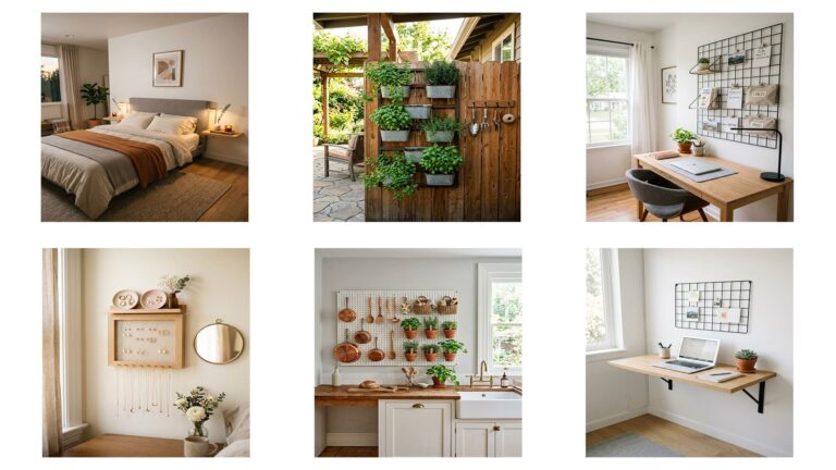
12. Vertical Herb Garden Wall
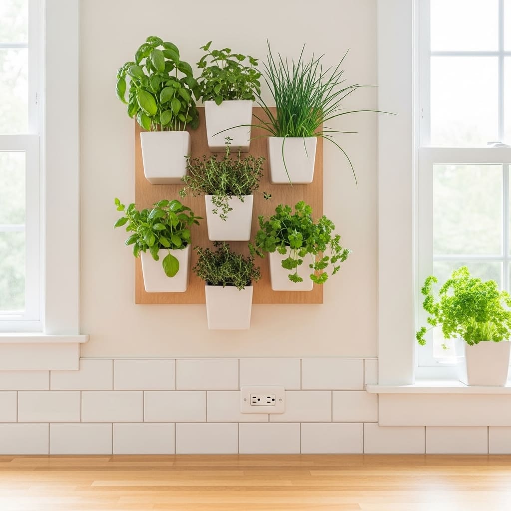
A wall-mounted herb garden turns an empty kitchen wall space into a living, fragrant, and edible display that no manufactured art can replicate. Fresh herbs growing directly on the wall bring immediate organic life, natural color, and genuine usefulness to the cooking environment. This idea works beautifully in kitchens with a blank wall beside a window that provides adequate natural light for plant growth.
Choosing white ceramic planters mounted on a light wood backing board creates a clean, structured grid that looks intentionally designed rather than improvised. The matching planter size and consistent spacing give the herb wall a gallery-quality uniformity that makes it read as a deliberate design feature. That structured approach elevates a practical growing solution into genuine kitchen wall art.
- Fresh herbs add living color and kitchen-ready fragrance
- White ceramic planters create clean, structured visual grid
- Natural light from nearby windows supports herb growth
- Works in modern farmhouse and organic kitchen styles
- Functional wall art that you actually cook with daily
Staggering the planter positions in a slight offset grid rather than a rigid straight-line arrangement creates a more dynamic and organic visual pattern. The slight asymmetry makes the wall display feel naturally grown rather than mechanically installed. That organic quality connects the herb wall back to the natural, living material it actually holds.
Labeling each planter with a small brass or black metal herb marker adds a finished, editorial detail that most people overlook. Clean labeling elevates the entire display from a practical growing setup to a styled kitchen feature. This small addition costs almost nothing and immediately upgrades the perceived quality of the whole herb wall arrangement.
13. Woven Basket Kitchen Wall
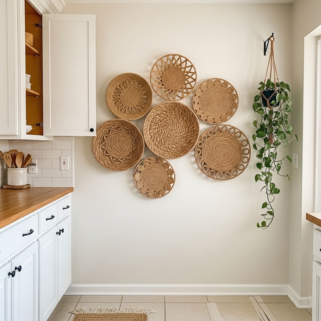
A cluster of woven wall baskets adds rich organic texture to a kitchen wall in a way that costs very little and installs with nothing more than standard picture hooks. The natural seagrass and jute materials bring an earthy, globally inspired warmth that suits bohemian, farmhouse, and natural modern kitchen styles. This approach provides a renter-friendly alternative to wallpaper or painted treatments.
Mixing basket diameters within the same cluster creates natural visual movement that draws the eye across the full arrangement. A large 24-inch basket as the anchor piece, two medium 16-inch baskets, and two smaller 12-inch pieces creates a satisfying range of sizes that fills the wall without overcrowding it. I’ve noticed that all-same-size basket walls always look less interesting than a well-mixed collection.
- Mixed basket sizes create natural visual movement
- Lightweight installation needs only picture hooks
- Works in boho, farmhouse, and natural modern kitchens
- Seagrass and jute tones suit cream and white walls
- Renter-friendly and damage-free wall decoration option
Positioning the largest basket slightly off-center rather than dead-center creates a more relaxed, organic cluster composition. A perfectly centered large basket forces a rigid symmetry that can feel mechanical. Shifting the anchor piece slightly to the left or right of center immediately makes the arrangement feel more naturally collected and casually stylish.
Mixing in one or two baskets with woven pattern details — diamond weave, chevron, or circular ridge patterns — adds visual variety within the consistent natural color palette. The pattern detail creates texture interest at close range while the overall neutral tone maintains cohesion from a distance. That range of interest at different viewing distances is what makes a basket wall genuinely compelling to look at.
14. Colorblock Kitchen Accent Wall
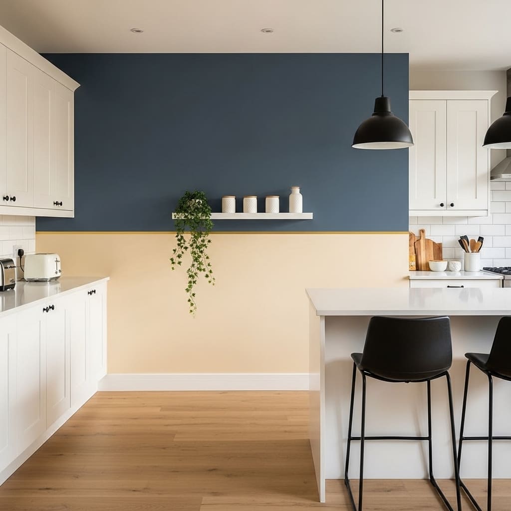
A color block accent wall brings a bold graphic energy to a kitchen that makes the entire room feel intentionally designed from a strong creative point of view. Dividing the wall horizontally between a deep tone above and a light tone below creates a visual anchor that grounds the kitchen without requiring any art, shelving, or accessories. This approach suits contemporary, maximalist, and design-forward kitchens.
Adding a thin painted gold or brass trim line at the color divide creates a precise, finished edge that elevates the color block from a paint experiment to a deliberate architectural detail. That thin metallic line prevents the two colors from bleeding together visually and adds a luxury finish that most people would assume required professional stenciling or wallpaper installation. It takes five minutes with painter’s tape and a small gold paint pen.
- Horizontal color division creates bold graphic wall statement
- Thin gold trim line at divide adds luxury finish detail
- Works in contemporary and design-forward kitchen styles
- Deep navy upper wall suits white cabinetry beautifully
- Floating shelf at the color line connects wall to surface
Choosing navy, deep sage, or warm terracotta for the upper color zone all work well with cream or white kitchen cabinetry on adjacent walls. The upper zone carries the color weight while the lighter lower zone keeps the room feeling grounded and open. That weight distribution mirrors how natural light falls in most rooms — brighter below, deeper above — which makes the arrangement feel instinctively correct.
A single white floating shelf positioned exactly at the color divide line acts as a practical and visual bridge between the two zones. Objects displayed on that shelf — small ceramic canisters, a trailing plant, a single candle — benefit from the contrasting background behind them. Deep navy behind a white ceramic canister makes it look more considered and intentional than any neutral wall could.
15. Copper Utensil Wall Display
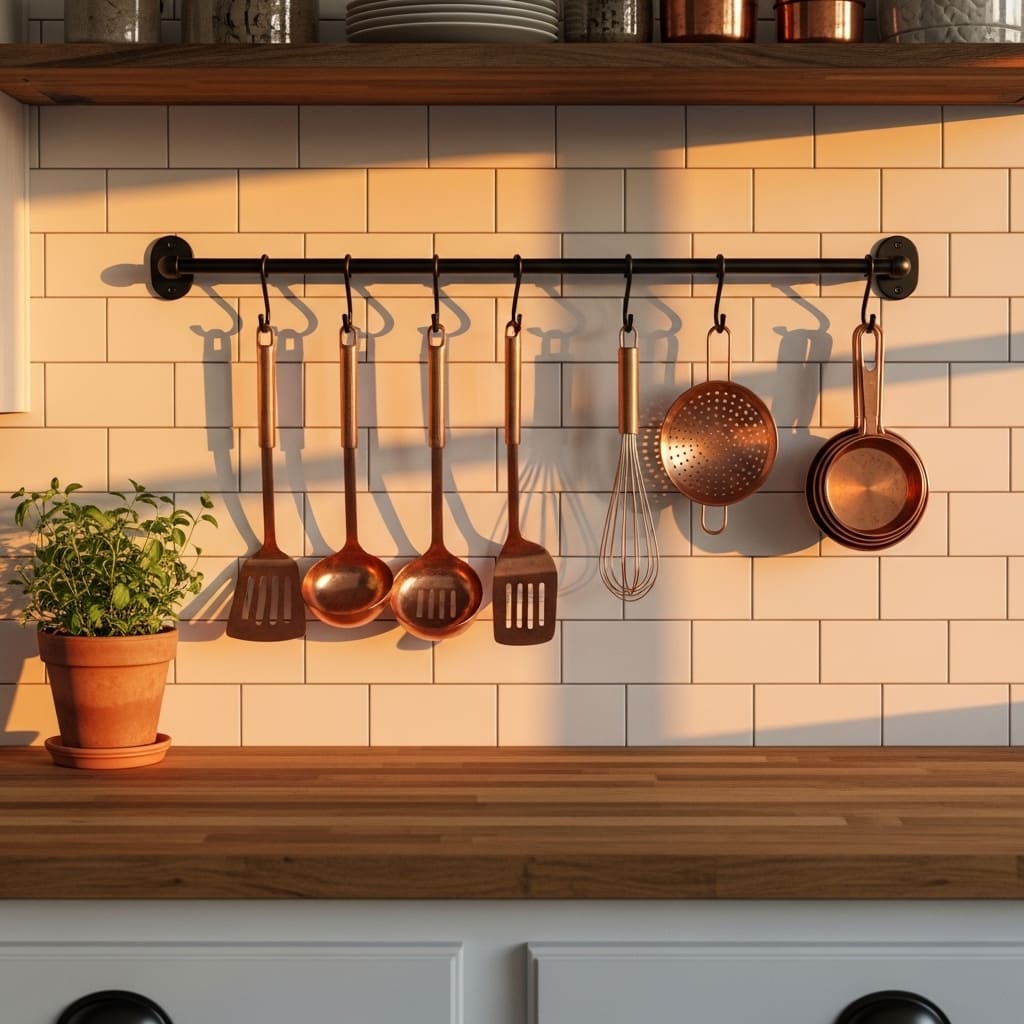
Hanging copper kitchen utensils from a wall-mounted rail turns everyday cooking tools into genuine kitchen wall art that glows warmly under natural and evening light. The warm amber and reddish-gold tones of copper against white subway tile create a color contrast that feels both practical and deliberately styled. This approach suits rustic, transitional, and artisan-inspired kitchens.
Copper reflects light differently at every hour of the day — from deep amber in morning light to bright gold in afternoon sun. That constant visual shift gives a copper utensil wall a living, dynamic quality that static art cannot replicate. I’ve seen copper rails transform completely unremarkable kitchen stretches of wall into the most noticed and complimented feature in the entire cooking space.elledecor
- Copper reflects warm light beautifully throughout the day
- Wall-mounted rail keeps utensils functional and displayed
- White subway tile creates perfect contrast behind copper
- Works in rustic, transitional, and artisan kitchen styles
- S-hooks make rearranging and adding pieces effortless
Choosing a matte black iron rail rather than chrome or stainless creates a stronger, more deliberate contrast with the warm copper utensils. Chrome hardware and copper tones compete visually. Matte black supports the copper tone without competing with it. That simple hardware choice determines whether the display feels cohesive or slightly mismatched.
Mixing copper weights — a heavy copper ladle alongside a lightweight copper measuring cup — creates visual variety within the monochromatic metal palette. The size variation keeps the eye moving along the rail from piece to piece. Hanging all identically sized utensils in a rigid evenly spaced row looks organized but lacks the collected, artisanal quality that makes this display idea so visually appealing.
16. Exposed Brick Kitchen Wall
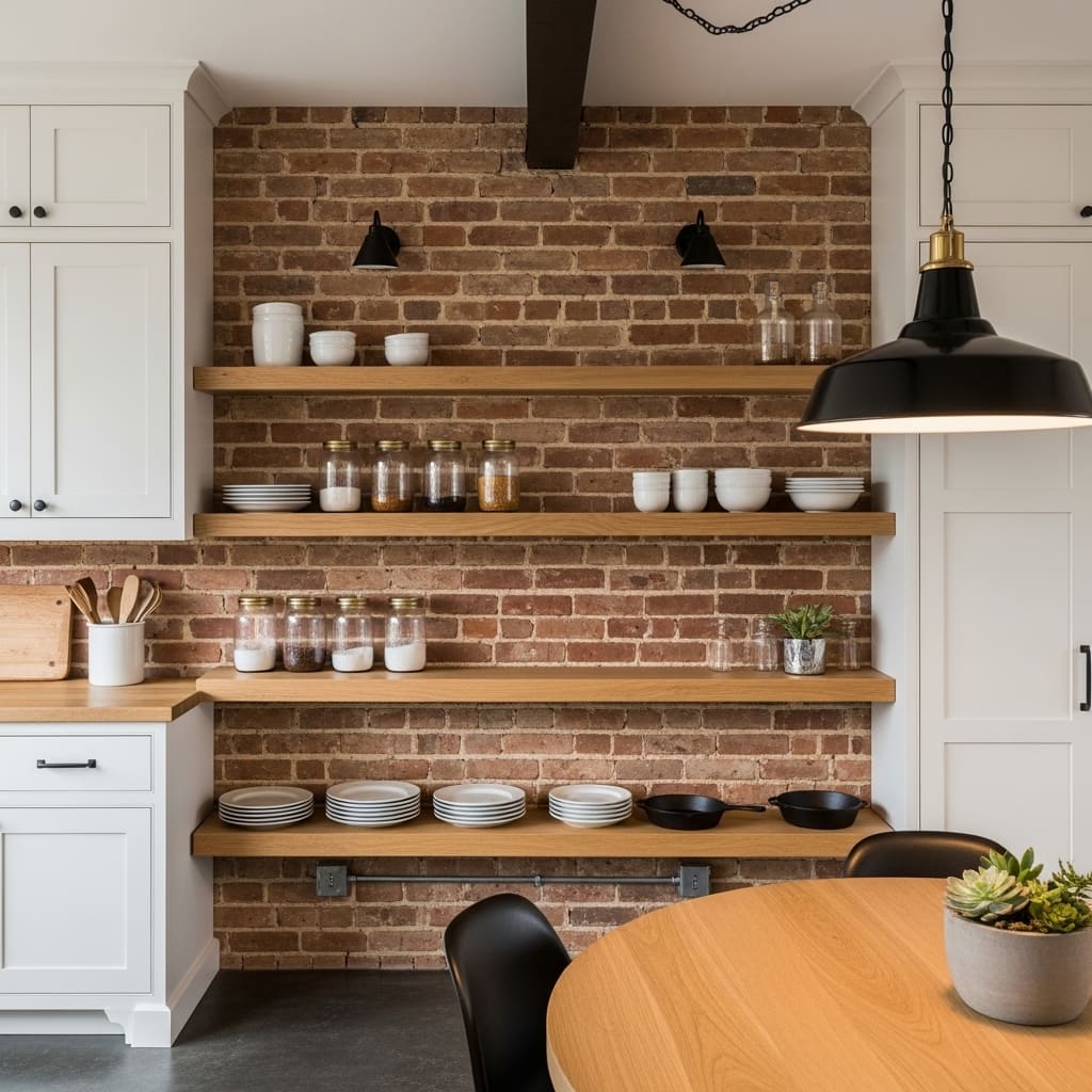
Exposed brick in a kitchen provides a raw, characterful backdrop that immediately gives the room a sense of history, warmth, and authentic material depth. The irregular color variation and mortar line texture of real brick creates a surface that looks richer the longer you look at it. This treatment suits industrial, loft-style, eclectic, and rustic modern kitchen interiors.
Brick veneer tiles now make this look achievable in kitchens that do not have original brick walls. Modern veneer products replicate the irregular texture and color variation of genuine aged brick with impressive fidelity. I’ve seen brick veneer kitchen walls installed over a single weekend by confident DIY homeowners with results that professional designers could not distinguish from the real material at a glance.
- Aged brick adds raw character no paint can replicate
- Irregular color variation creates naturally rich texture
- Works in industrial, loft, and rustic kitchen styles
- Brick veneer tiles offer affordable DIY installation option
- Open oak shelves contrast beautifully against warm brick
Sealing the brick surface with a clear matte sealer prevents the fine red dust that unsealed brick gradually releases onto nearby countertops and food preparation surfaces. In a kitchen environment, this maintenance step is non-negotiable for health and cleanliness reasons. One application of food-safe matte sealer resolves the dust issue entirely without altering the natural brick appearance.
Positioning open floating shelves directly against the brick wall creates a layered visual composition where the wood shelf material contrasts warmly with the brick texture behind it. Ceramic, glass, and cast iron objects displayed on those shelves gain significant visual richness from the aged brick backdrop. The combination of brick, oak, ceramic, and glass covers all four primary texture categories — rough, smooth, matte, and reflective — that make a room visually complete.
17. Monochrome Kitchen Print Set
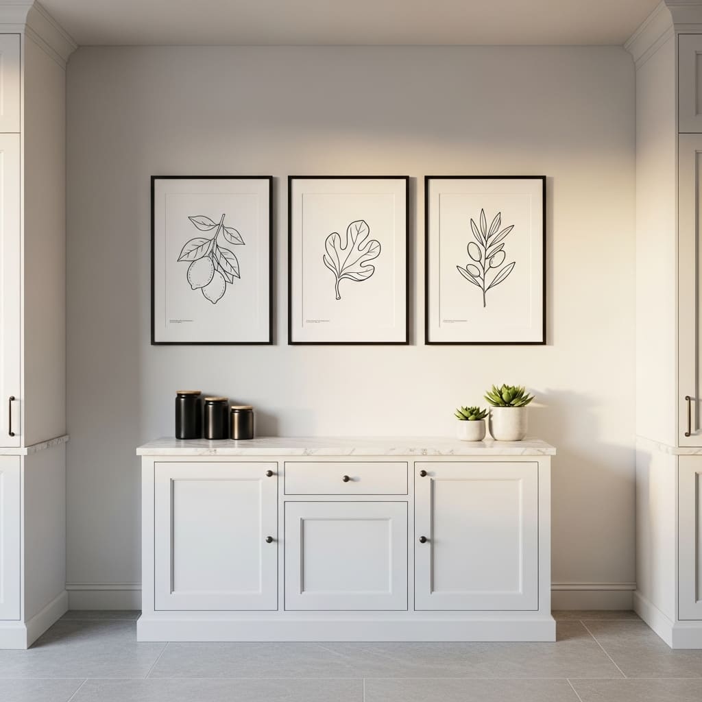
A set of three matching black-and-white botanical prints hung in a precise horizontal line creates one of the cleanest and most reliably elegant kitchen wall treatments for modern minimalist homes. The monochrome palette removes all color decisions and lets the quality of the illustration and frame do all the decorative work. This approach suits minimalist, Japandi, Scandinavian, and contemporary kitchen styles.
The subject matter of botanical line drawings — lemons, figs, olives, herbs — connects directly to the kitchen’s identity as a food-centered space. That thematic connection between the art and the room gives the display a natural logic that abstract or figurative art in the same space would lack. I’ve noticed that kitchen art with food or plant subjects always feels more purposefully placed than purely decorative prints in a cooking environment.
- Monochrome palette suits minimalist and Japandi kitchens
- Botanical subjects connect naturally to kitchen identity
- Matching black frames create clean, precise gallery row
- Works in white and gray toned kitchen color schemes
- Three-print horizontal row suits most standard wall widths
Choosing line drawings rather than filled illustrations keeps the monochrome prints feeling light and airy rather than heavy. Fine, delicate botanical line art in black ink on white paper has a graphic quality that suits modern kitchens without feeling cold or impersonal. The botanical subject softens what would otherwise be a purely graphic aesthetic.
Hanging all three prints at the same height with precisely equal spacing between frames creates a structured, intentional appearance that reads as professionally installed. Using a level, measuring equal gaps of 2 to 3 inches between frames, and centering the group above the sideboard below produces a result that looks custom-designed. That precision in placement is the detail that distinguishes expensive-looking wall arrangements from casual ones.
18. Wainscoting Kitchen Wall Panel
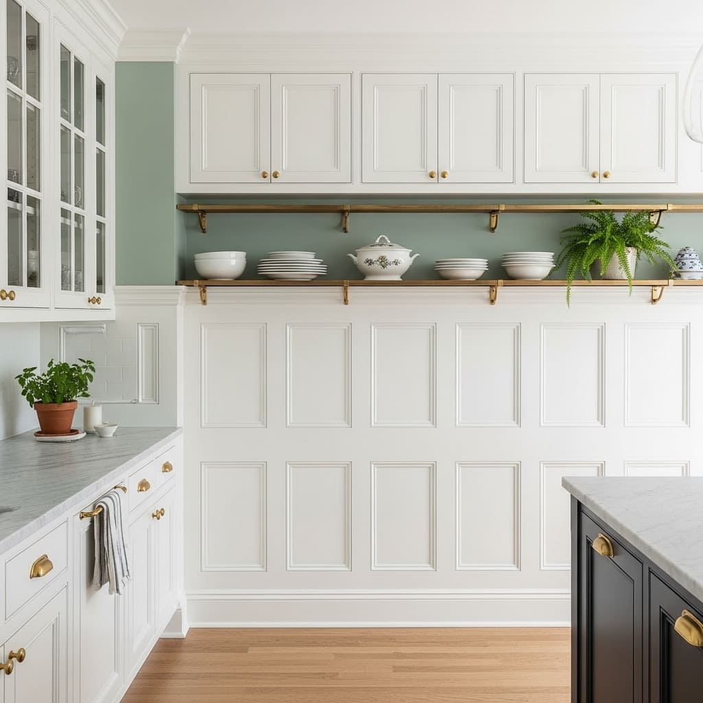
Kitchen wainscoting panels add permanent architectural character to kitchen walls that makes the room feel genuinely built with intention and quality craftsmanship. The recessed rectangular paneling detail on the lower wall section creates a visual richness that a plain painted surface can never replicate. This treatment suits traditional, transitional, and classic American kitchen styles.
Painting the wainscoting panels bright white and the upper wall in a contrasting soft color — sage green, dusty blue, or warm terracotta — creates a two-tone kitchen wall that looks deliberately layered and professionally designed. That color division at the wainscoting line draws a clear visual boundary between the practical lower zone and the decorative upper zone. I’ve seen this combination completely redefine the character of a plain builder-grade kitchen.
- Classic wainscoting adds permanent architectural character
- Two-tone color scheme makes kitchen walls look layered
- White panels contrast beautifully with colored upper walls
- Works in traditional and transitional kitchen styles
- Brass hardware complements white paneling beautifully
Installing wainscoting using MDF tongue-and-groove beadboard panels provides the quickest and most affordable route to this traditional kitchen wall treatment. Pre-primed MDF panels cut to wainscoting height install with construction adhesive and minimal finishing nails. The result is visually identical to custom carpentry work at a fraction of the labor cost.
Adding a continuous chair rail molding at the top edge of the wainscoting creates a precise, finished transition between the paneled lower section and the painted upper wall. This molding detail is what separates properly installed wainscoting from a simple painted lower section. The chair rail’s physical projection from the wall creates shadow and depth that emphasizes the paneling’s three-dimensional quality.
19. Vintage Tin Sign Collection
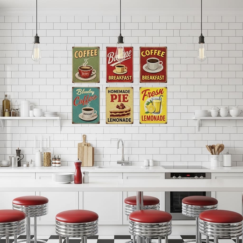
Vintage tin sign collections bring a warm, nostalgic Americana energy to kitchen walls that no modern art print can fully replicate. The faded graphic quality, aged color palette, and retro food advertising imagery create an instantly recognizable visual language that feels collected over decades rather than purchased in one shopping trip. This approach suits retro, diner-inspired, farmhouse, and eclectic American kitchen styles.
Building a vintage tin sign collection from thrift stores, antique markets, and estate sales produces the most genuinely aged and visually varied result. Each sign carries its own history of paint fading, minor rust spots, and surface wear that gives the collection authentic character. That genuine patina is impossible to replicate with newly manufactured reproduction signs, no matter how well they simulate aging.
- Faded tin signs create authentic retro Americana character
- Mix 6 to 8 signs in varying sizes for organic arrangement
- Food-themed imagery connects naturally to kitchen purpose
- Works in retro, diner, and eclectic kitchen styling
- Thrift-sourced signs carry genuine aged character and patina
Arranging the tin signs in an irregular cluster rather than a rigid grid preserves the casual, collected quality that makes this display idea so appealing. Rigid grid arrangements make vintage signs look like a purchased wall decor set rather than a personally gathered collection. The slight randomness of an organic cluster is exactly what signals genuine collecting rather than retail styling.
Grouping signs by color family — reds and creams together, or blues and yellows together — within the irregular cluster creates enough visual cohesion to prevent the arrangement from feeling chaotic. That underlying color grouping is the organizing principle that holds a varied collection together without forcing it into a rigid geometric structure.
20. Subway Tile Kitchen Feature Wall
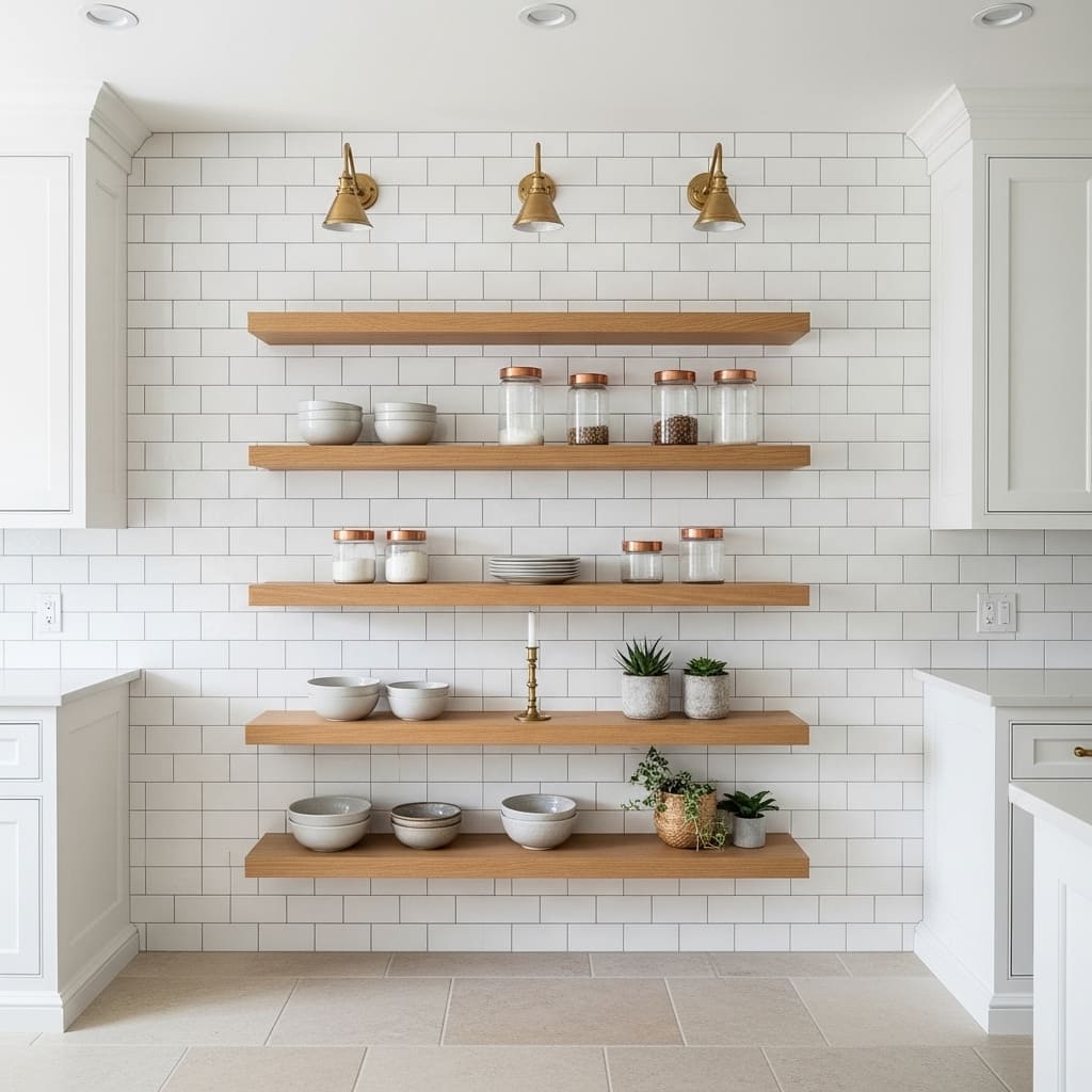
Floor-to-ceiling white subway tiles behind open kitchen shelving create the most classic and reliably timeless kitchen wall treatment in American interior design. The offset brick-lay pattern and thin gray grout lines produce a surface that looks simultaneously clean, textured, and quietly sophisticated. This treatment suits modern classic, transitional, and minimalist kitchen styles across almost every home type and budget.
White subway tile has maintained its position as the most enduringly popular kitchen wall treatment for over a hundred years precisely because it suits every kitchen style, era, and color palette simultaneously. It works equally well behind warm wood open shelving, sleek black cabinetry, and painted farmhouse furniture. That versatility makes it the most reliable investment in kitchen wall design for homes where longevity matters.
- Classic subway tile suits every kitchen style and era
- Offset brick-lay pattern adds subtle visual texture
- Thin gray grout lines create clean, precise grid detail
- Works behind open shelving as a full-wall feature
- Brass and copper accessories shine against white tile
Choosing gray grout rather than white grout for white subway tiles creates more visible definition between individual tiles from a distance. White grout makes the tiles blend together and loses the graphic quality of the tile pattern. Gray grout maintains the individual tile outline without the heavy contrast of dark grout, which can age-stain visibly over time in a kitchen environment.
Extending the subway tile from countertop height all the way to the ceiling dramatically increases the visual impact compared to a standard backsplash height installation. Full-height tiling makes the kitchen wall feel architectural rather than purely practical. That vertical extension is one of the most cost-effective ways to make a standard kitchen look genuinely designed and considered.
21. Framed Tea Towel Wall Art
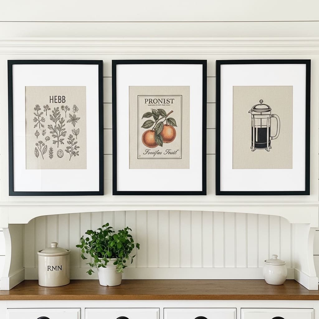
Framing printed tea towels as kitchen wall art is one of the most creative and budget-friendly kitchen wall decor ideas available to any home decorator. Quality illustrated linen tea towels in botanical, culinary, or vintage illustration styles look genuinely sophisticated when properly matted and framed. The natural linen texture adds warmth that standard paper prints cannot provide.
I’ve tried this technique in a farmhouse kitchen and the result consistently surprises people who assume the framed pieces are expensive art prints. The key lies in choosing towels with fine illustration work rather than novelty graphic prints. Botanical herb illustrations and vintage fruit drawings look the most timeless and universally appealing within a kitchen setting.
- Framed tea towels look like expensive art prints
- Natural linen texture adds warmth paper prints lack
- Botanical and vintage culinary subjects suit kitchens best
- Matching black frames unify three different towel designs
- Budget-friendly option that photographs beautifully in frames
Wide cream matting inside the frame creates the visual breathing space that makes each towel appear more important and gallery-worthy. Matting transforms a flat practical object into a framed artwork simply through proportion and spacing. A towel framed without matting looks like a framed towel. A towel framed with wide matting looks like considered art.
Sourcing illustrated tea towels from independent artists and specialty kitchen shops produces the most distinctive and personal selections. Mass-market novelty towels with bold lettering rarely frame as successfully as finely illustrated botanical or culinary subjects. Spending slightly more on a beautifully illustrated towel produces dramatically better results once it is matted and framed.
22. Pegboard Kitchen Organizer Wall
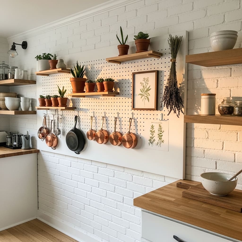
A styled pegboard panel turns a blank kitchen wall into the most versatile and functional wall decor solution in any cooking space. The modular hook-and-shelf system allows endless rearrangement as kitchen needs evolve, making it simultaneously a practical storage solution and a living wall display. This approach suits modern farmhouse, industrial, and small kitchen environments where wall space must work doubly hard.
Painting the pegboard the same color as the surrounding wall — white against white brick, or cream against cream plaster — creates a seamless, architectural appearance where the board itself disappears and only the displayed objects stand forward. That tonal blending technique makes the pegboard look far more intentional and designed than a raw natural wood or unpainted board would ever achieve.
- Pegboard provides infinitely adjustable wall organization
- Painted to match the wall it blends in seamlessly
- Copper hooks and wooden dowel shelves add warm detail
- Works in farmhouse, industrial, and small kitchen spaces
- Living arrangement that evolves with your kitchen needs
Adding two to three small potted succulents or air plants into the pegboard arrangement brings organic life to what could otherwise feel like purely functional storage. Plants tucked between hanging utensils and small framed art create the layered, curated quality that separates a styled pegboard from a utilitarian one. That organic layer is the detail that makes kitchen pegboard walls earn high saves on home inspiration platforms.
Mixing object types — functional utensils, decorative plants, a small framed print, and a bundle of dried herbs — covers all the visual categories that make a wall display feel complete. Each category contributes a different texture: metal, organic, paper, and dried botanical. That texture variety within a single pegboard arrangement creates genuine visual richness at every viewing distance.
23. Hand-Painted Mural Panel
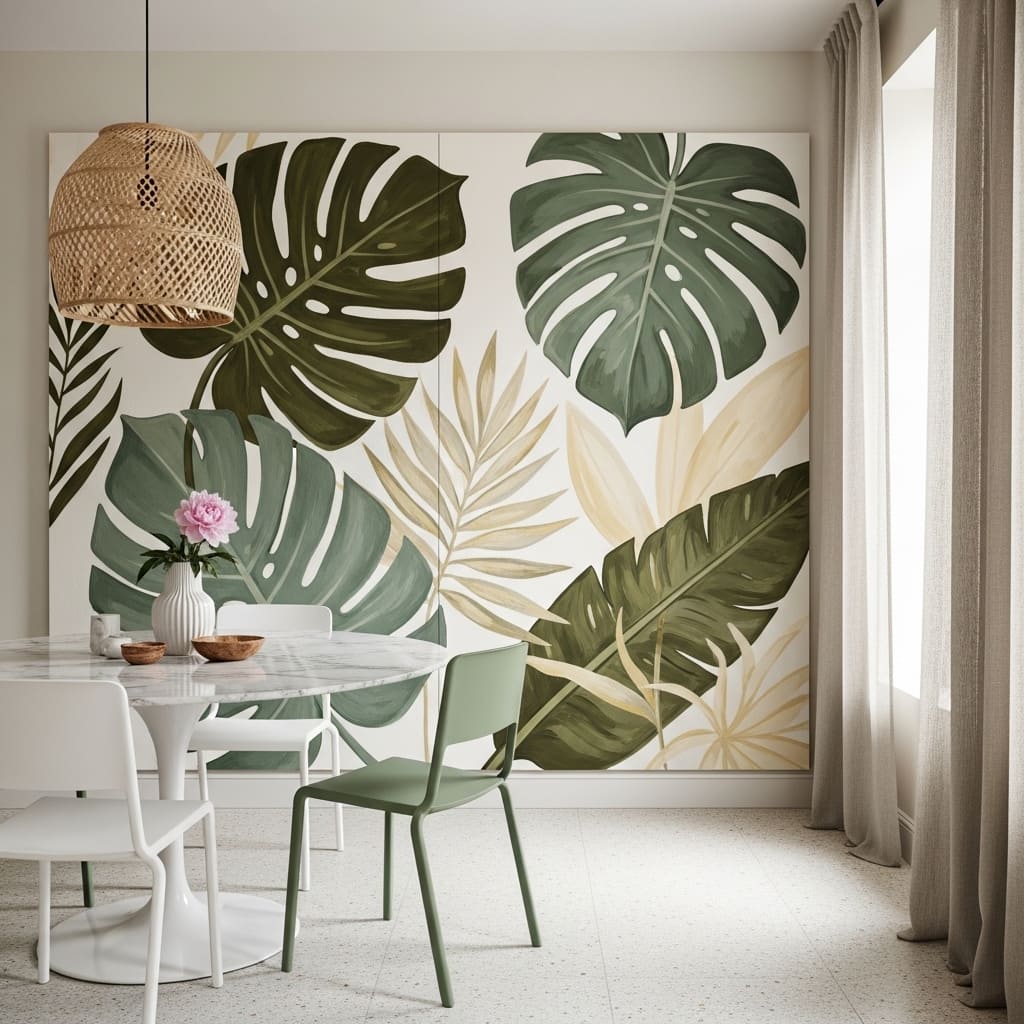
A hand-painted mural panel on one kitchen or kitchen dining wall creates a one-of-a-kind feature that gives the entire space an instant artistic identity no manufactured wall treatment can replicate. Oversized botanical illustrations in a loose, expressive style suit both contemporary and eclectic kitchens beautifully while connecting the room’s food and nature-centered identity through the art itself.
Commissioning a local artist to paint a custom botanical or food-themed mural transforms the kitchen wall into a genuine piece of original art. Many emerging artists offer wall mural commissions at surprisingly accessible price points, and the result adds provenance, personality, and permanent value to the home. I’ve seen a single commissioned kitchen mural become the most talked-about feature of an entire house during social gatherings.
- Custom mural gives kitchen walls genuine artistic identity
- Oversized botanical leaves suit kitchen’s natural theme
- Local artist commissions cost less than most people expect
- Works in eclectic, artistic, and contemporary kitchen styles
- One mural wall makes the entire kitchen feel fully designed
Planning the mural composition around the furniture and fixtures that remain in place ensures the painted elements complement rather than compete with existing elements. A mural that flows around a window frame, curves above an open shelf, or frames an apron sink treats the kitchen’s architecture as part of the artwork. That integration of mural and architecture is what makes the most successful kitchen murals feel permanently belonging.
Working with a soft, botanical color palette — deep olive, dusty sage, warm cream, and terracotta — keeps the mural harmonious with natural kitchen materials like stone countertops, wood shelving, and ceramic accessories. These earthy botanical tones photograph beautifully in natural light and never feel trendy or time-limited. A botanically toned kitchen mural remains relevant and beautiful across decades of home ownership.
24. Floating Knife Magnetic Wall Strip
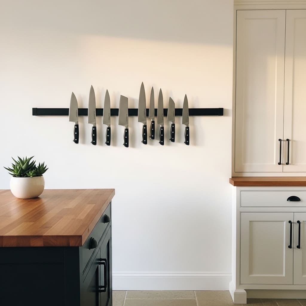
A wall-mounted magnetic knife strip turns a set of quality kitchen knives into a functional wall sculpture that reads as genuinely professional and curated. Eight chef’s knives hung in a precise horizontal row create a clean, graphic kitchen wall feature that signals culinary seriousness and design awareness simultaneously. This approach suits minimalist, modern, and kitchen-focused home environments.
The matte black magnetic strip against a white wall creates one of the strongest and most graphic monochrome contrasts available in kitchen wall styling. Each knife blade reflects light individually, adding subtle metallic shimmer to the display. That combination of matte black hardware, white wall, and reflective blade surfaces produces a visually sophisticated kitchen wall feature that costs less than thirty dollars to install.
- Magnetic knife strip creates a chef-inspired wall display
- Blades reflect light and add subtle metallic shimmer
- Matte black strip contrasts powerfully against white walls
- Keeps knives safely accessible and beautifully displayed
- Works in minimalist, modern, and professional kitchen styles
Aligning all knife handles at exactly the same height on the strip creates a precise, disciplined row that looks intentionally designed. Uneven handle heights make the display appear careless rather than curated. That single alignment detail determines whether the knife strip reads as a considered kitchen wall feature or simply as convenient storage.
Positioning the knife strip above a butcher block counter section creates a complete chef’s station vignette. The dark wood counter below, the white wall, and the knife display above form a self-contained, purpose-driven kitchen zone that looks both functional and editorial. That station approach — grouping tools, surface, and wall display into one cohesive zone — is a technique professional kitchen designers use consistently.
25. Decorative Cutting Board Gallery
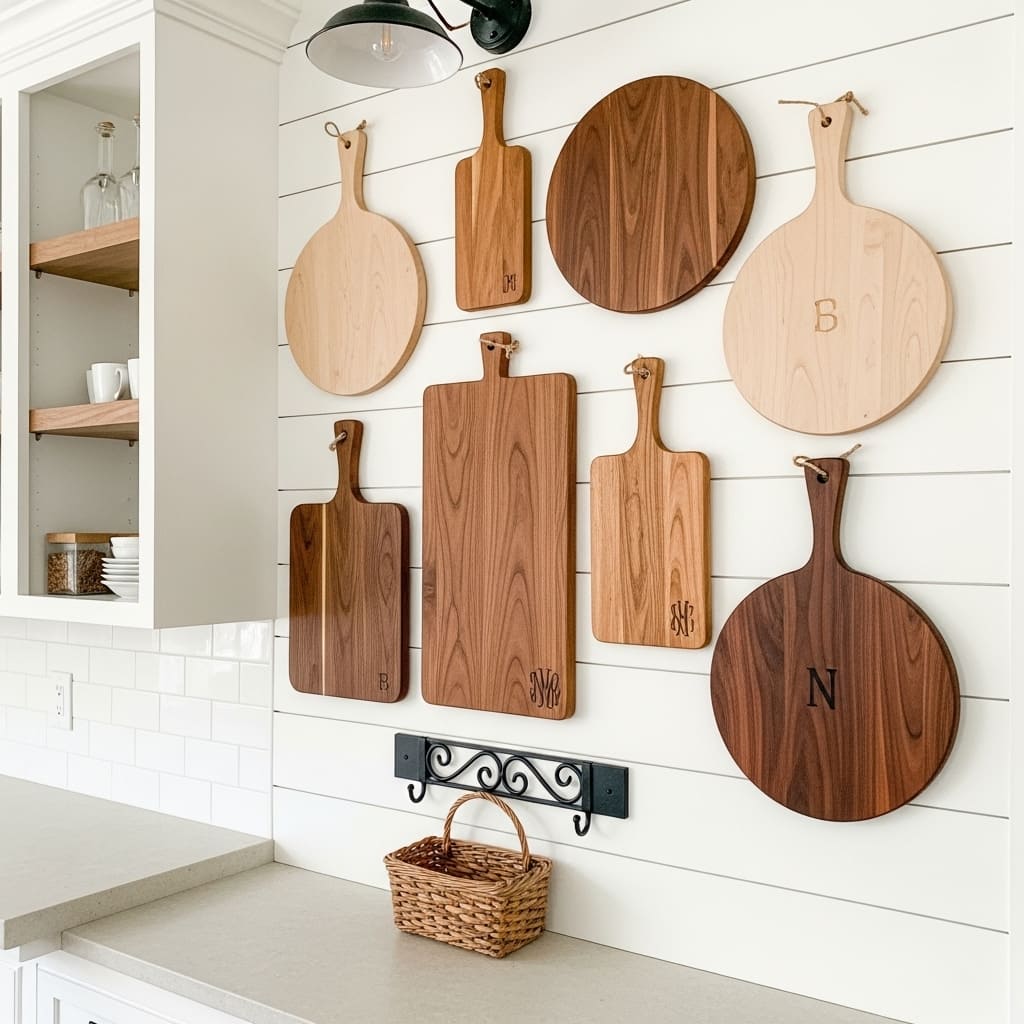
A gallery of decorative wooden cutting boards creates one of the most kitchen-specific and visually warm wall displays possible in a cooking space. The mix of round, rectangular, and paddle shapes in varying wood tones — maple, walnut, and cherry — produces natural color contrast and organic shape variety that no manufactured art set can match. This approach suits farmhouse, rustic, and warm modern kitchen styles.
Personalizing one or two boards with burned wood monograms or initials adds a custom, heirloom quality to the display. That small personalization detail transforms a collection of functional kitchen tools into a meaningful, curated wall feature with genuine family character. I’ve noticed that monogrammed cutting board walls consistently generate the warmest emotional responses from guests because they feel both personal and beautifully crafted.
- Wood tone variation creates natural warm color contrast
- Mixed board shapes add organic visual variety to the wall
- Burned monograms add custom, heirloom character to boards
- Works in farmhouse, rustic, and warm modern kitchen styles
- Functional art that doubles as actual usable kitchen tools
Arranging the boards in an organic cluster rather than a rigid grid preserves the collected, gathered quality that makes this display so appealing. A loose arrangement with varying gap sizes between boards mimics the casual beauty of objects accumulated over time rather than purchased together as a set. That natural arrangement quality is exactly what makes a cutting board wall feel genuinely farmhouse rather than simply themed.
Sourcing boards from artisan woodworkers, farmers markets, and handcraft shops produces the most distinctive and genuinely varied collection. Artisan-made boards carry unique grain patterns, natural edge variations, and imperfect surface details that mass-produced boards lack entirely. Those individual character details make each board more interesting as a wall display piece and more appreciated as a functional kitchen tool.
26. Wallpaper Kitchen Feature Wall
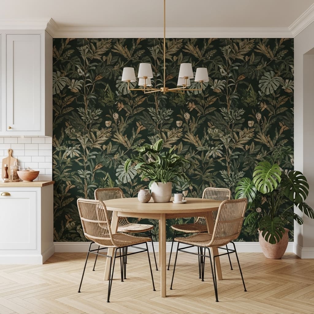
A botanical wallpaper feature wall in a kitchen dining area creates an immersive, lush backdrop that makes the entire room feel like a designed space rather than a functional one. Large-scale tropical leaf prints in deep forest green against a white or cream background bring dramatic visual weight and organic richness to a kitchen that no paint color alone can match. This treatment suits eclectic, maximalist, and botanically inspired kitchen dining rooms.
Wallpaper in a kitchen dining area — rather than in the main cooking zone — avoids the steam, grease, and moisture concerns that make wallpaper impractical near stoves and sinks. The dining end of an open-plan kitchen provides the ideal protected wall for a dramatic wallpaper installation. That practical placement decision allows the full visual impact of premium wallpaper without the durability risk of positioning it too close to active cooking.
- Botanical wallpaper creates immersive, lush kitchen atmosphere
- Large-scale tropical leaf prints add dramatic visual weight
- Dining area placement avoids steam and grease damage
- Deep forest green works with oak, rattan, and brass
- Works in eclectic, maximalist, and botanical kitchen styles
Choosing a peel-and-stick wallpaper version makes this treatment renter-friendly and fully reversible without damage to the underlying wall surface. Peel-and-stick botanical wallpapers now come in high-quality printed finishes that are visually indistinguishable from traditionally hung wallpaper in photographs. That reversibility removes the commitment barrier that prevents many renters from pursuing bold kitchen wall treatments.
Pairing forest green botanical wallpaper with brass lighting, rattan furniture, and terracotta plant pots creates a cohesive palette that feels simultaneously tropical and warm. The cool dark green of the wallpaper balances against the warm amber of the brass and rattan, creating a temperature contrast that keeps the room visually lively. That warm-cool balance within a bold palette is what makes this kitchen wall treatment feel expertly designed.
27. Antique Mirror Kitchen Wall
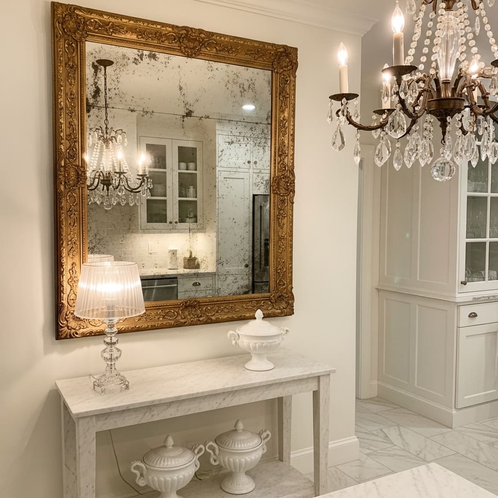
An antique mirror in a heavily carved gold leaf frame adds an unexpected and dramatically luxurious touch to a kitchen dining area that immediately elevates the entire room’s perceived quality. Aged foxing and slight tarnish on the mirror surface create a genuine antique character that reproduction mirrors cannot replicate. This treatment suits vintage glam, French country, and traditional kitchen styles.
Mirrors in kitchen dining areas serve a practical purpose by reflecting candlelight and warm overhead lighting across the room during evening meals and entertaining. That light reflection creates a warm, flattering atmosphere that makes the kitchen dining area feel genuinely special rather than simply functional. I’ve seen one well-placed antique mirror completely transform how guests perceive and enjoy a kitchen dining space during evening gatherings.
- Antique foxing adds genuine aged mirror character
- Gold leaf carved frame signals immediate luxury quality
- Mirror reflects candlelight warmly across dining area
- Works in vintage glam and French country kitchen styles
- Pairs beautifully with marble surfaces and crystal lighting
Sourcing genuine antique mirrors from estate sales, antique dealers, and auction sites produces pieces with authentic character that reproduction mirrors simply cannot match. The irregular foxing patterns, slight silver variations, and aged frame gilding of a genuine antique piece carry a provenance and uniqueness that manufactured reproductions always lack regardless of quality.
Positioning an antique mirror above a marble console or sideboard creates a complete vignette that bridges the wall feature to the surface below. A crystal lamp, a ceramic compote bowl, and a single fresh flower stem on the console below complete the arrangement. That connection between the mirror and the styled surface underneath it is what transforms a single hung piece into a designed wall moment.
28. Washi Tape Geometric Wall Art
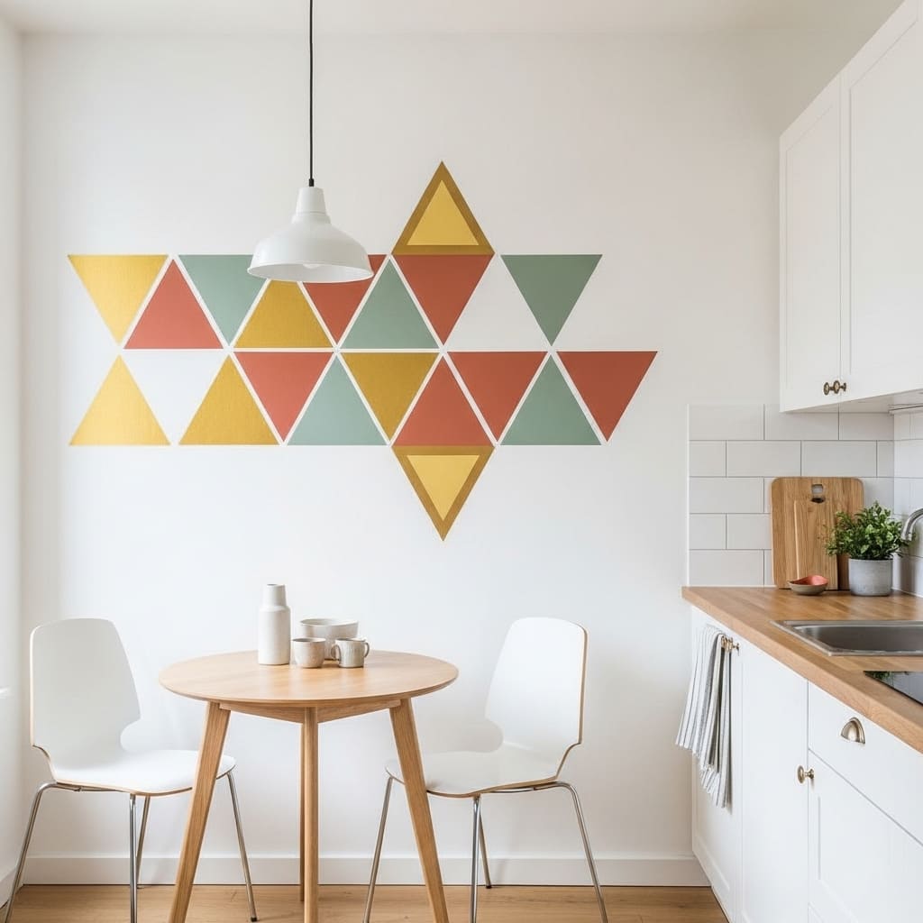
Washi tape geometric wall art creates a surprisingly sophisticated kitchen wall feature that costs under fifteen dollars and takes less than one hour to apply. Layered diamond and triangle patterns in coordinated tape colors produce a graphic, contemporary design that looks like intentional geometric art rather than a budget craft project when executed with clean lines and deliberate color choices. This approach suits small apartments, rental kitchens, and anyone who wants bold wall impact without permanent commitment.
The rental-friendly quality of washi tape wall art makes it one of the most practically appealing kitchen wall decor ideas for apartment dwellers. Washi tape removes completely from painted wall surfaces without leaving adhesive residue or peeling paint — a critical advantage in any rental space. That zero-damage removal makes bold geometric wall art achievable in kitchens where landlords prohibit painting, shelving installation, or any wall modification.
- Creates bold geometric art for under fifteen dollars
- Removes completely without damaging painted wall surfaces
- Gold and terracotta tones suit warm modern kitchens
- Works perfectly in rental and small apartment kitchens
- Takes under one hour to apply with clean precision
Planning the geometric pattern on paper before applying tape to the wall saves significant time and prevents the frustration of removing and repositioning tape repeatedly. A simple pencil sketch with measurements allows you to transfer the design confidently and precisely onto the wall surface. That planning step is the difference between a crisp, professional-looking result and a slightly crooked, uneven one.
Choosing tape colors that echo the kitchen’s existing accent tones — matching the warm gold to cabinet hardware, or the sage green to a plant pot — creates a cohesive relationship between the wall art and the surrounding room. That color connection makes the washi tape design feel like a planned design element rather than a crafting project applied to an unrelated space.
Conclusion
Your kitchen walls deserve just as much care and creativity as every other room in your home. These 28 kitchen wall decor ideas prove that bare, plain walls are always a choice — and a better one is always within reach. You do not need a large budget or a professional designer to make your kitchen walls look genuinely beautiful and intentional. I’ve seen how one well-chosen wall treatment changes the entire energy of a cooking space and makes people genuinely proud of the room they spend so much daily time in. Save this article on Pinterest, try one idea this weekend, and share it with a friend whose kitchen walls need a fresh direction.
Frequently Asked Questions
What is the easiest kitchen wall decor idea for beginners?
A single oversized art print in a quality frame is the easiest starting point. You hang one piece, choose a size that fills the wall properly, and the room looks immediately styled. No arrangement skills required. One correctly scaled print always looks more intentional than multiple small pieces hung without a plan.
How do I decorate kitchen walls without damaging them?
Use adhesive picture strips rated for the weight of your chosen art. Washi tape geometric art, peel-and-stick wallpaper, and removable hooks all work without wall damage. These options suit renters completely. Always check the weight rating on adhesive products before hanging anything heavier than a small framed print.
What color art looks best on white kitchen walls?
Warm terracotta, sage green, and deep navy all stand out beautifully against white kitchen walls. Earthy botanical tones photograph especially well in natural morning light. Cool blue-gray tones suit modern minimalist kitchens. Avoid pure black-and-white art if your kitchen already uses very high contrast cabinet hardware.
Can I hang art near a kitchen stove?
Keep art at least 24 inches away from any active cooking surface. Grease, steam, and heat damage frames, paper, and canvas over time. The safest kitchen art positions are above a sideboard, beside cabinetry runs, above open shelving, or in the dining area of an open-plan kitchen layout.
How do I make open kitchen shelves look styled and expensive?
Use the rule of three on each shelf — one functional group, one organic element, and one decorative object. Leave deliberate empty space between items. Choose accessories in two coordinating tones only. Matching ceramic pieces, glass jars with matching lids, and one small plant create a cohesive, curated look every time.
What size art works best above a kitchen counter?
Art hung above a kitchen counter should measure at least 18 to 24 inches wide for a standard 36-inch counter section. A piece that is too small looks timid and disconnected from the surface below. The art width should span at least 50 percent of the counter or furniture width it sits above.
Is wallpaper a good idea for kitchen walls?
Wallpaper works well in kitchen dining areas and protected wall sections away from cooking zones. Avoid wallpaper directly behind stoves or above sinks. Vinyl-coated and peel-and-stick wallpapers offer better moisture resistance than standard paper types. A kitchen dining area feature wall in botanical wallpaper is one of the most impactful and practical wallpaper applications in the home.